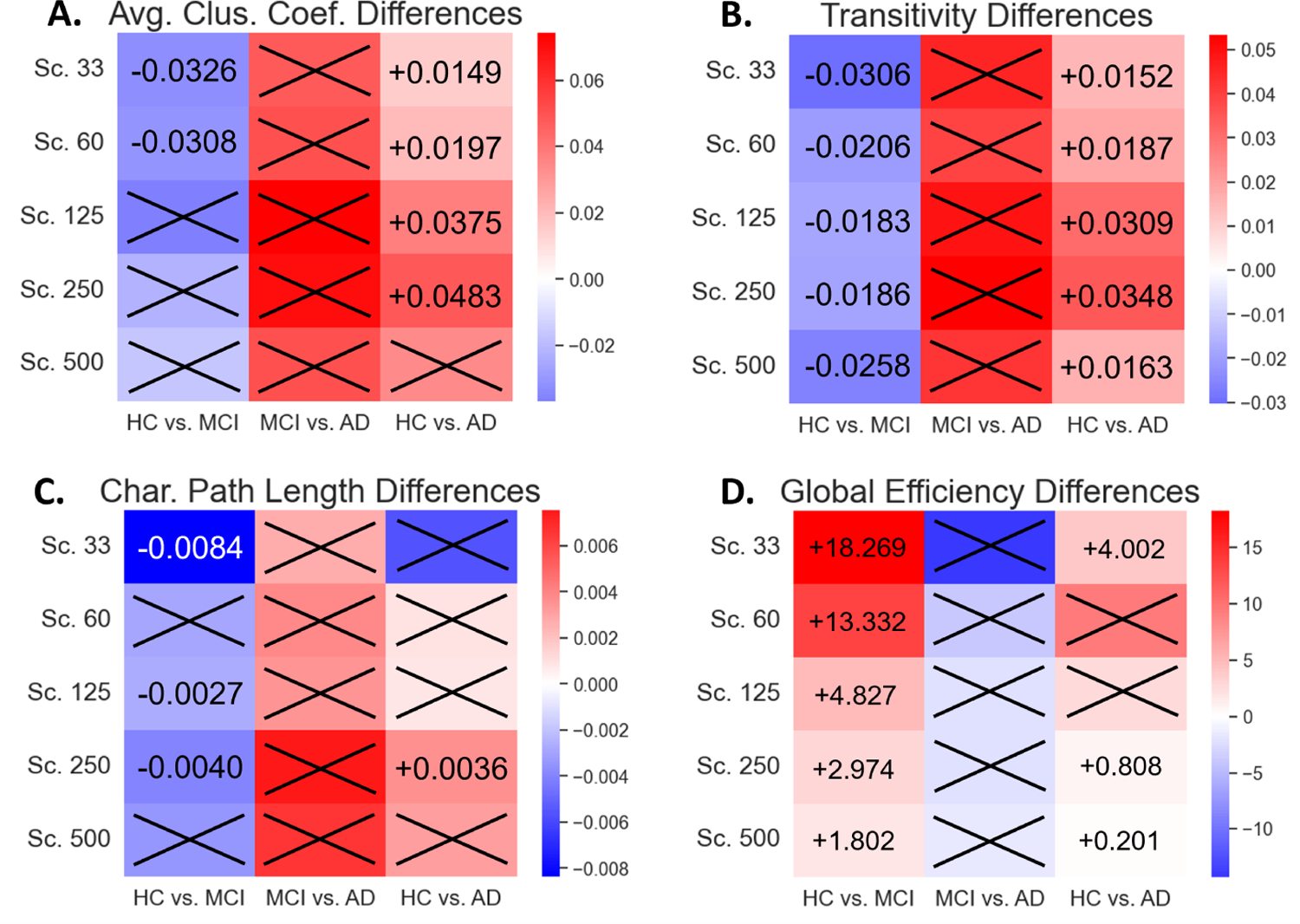
Fig. 3.

Heatmaps were constructed to depict the directionality of change in the network measurements with respect to increasing disease severity. The first column in each subplot is the difference when progressing from HC to MCI, the second is from MCI to AD, and the third is from HC to AD. Red coloration indicates that the measure increases as disease severity increases, while blue coloration indicates that the measure decreases as disease severity increases. Results are shown for average clustering coefficient (A), transitivity (B), characteristic path length (C), and global efficiency (D). Numerical labels indicate the difference in medians between the two groups with respect to increasing disease severity.
