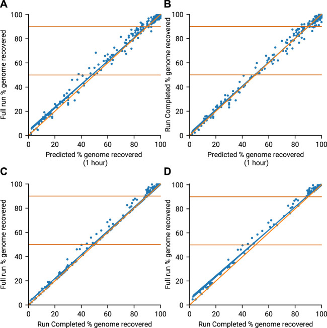
FIGURE 3.
Genome recovery throughout all 13 runs. Blue line (line of best fit), Orange line (x = y). (A) Compares the predicted genome recovery based on 1 hours sequencing (X-axis) with the actual coverage seen at the end of the run (Y-axis). Predicted recovery is the proportion of amplicons in a sample expected to reach 20× coverage. Actual coverage is the proportion of non N bases in the consensus genomes obtained at the end of the run (Full Run). (B) Compares the same predicted genome recovery with the actual coverage observed at the Run Complete time as defined by minoTour. (C) Compares the actual coverages reported in A (Full Run) and B (Run Complete). (D) Is the same as C but ignores those runs where the Run Complete time is the same as the Full Run time.

