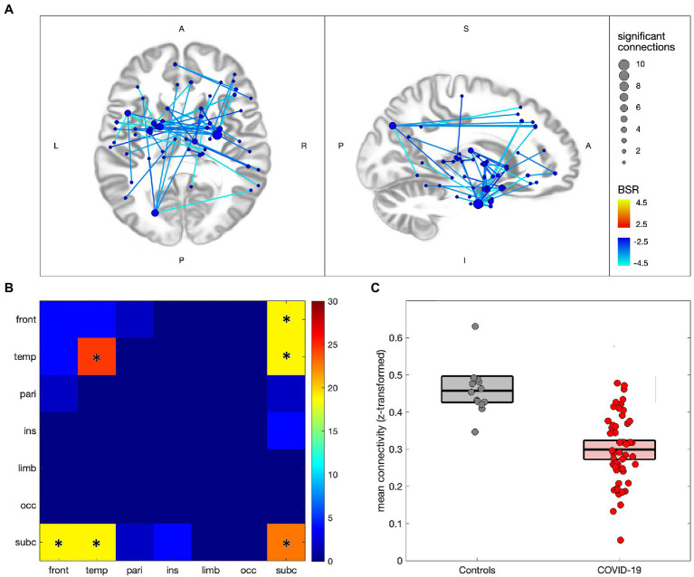
Figure 2.
Altered network functional connectivity for individuals with COVID-19 relative to controls. (A) significant connections are depicted via lines connecting regions of interest (ROIs), with warm colors indicating increased connectivity for the COVID-19 group, and cool colors denoting decreased connectivity; line colors denote the strength of effect in terms of bootstrap ratio (BSR) and node sizes denote the number of significant connections. (B) heatmap showing the percentage of significant connections that occur between a given pair of lobes; a ‘*’ denotes significantly elevated connections for the lobe pair. (C) scatterplot showing mean connectivity values within regions of significant decrease, plotted for individuals in the COVID-19 and control groups; boxplots denote group means and 95%CIs of the mean.

