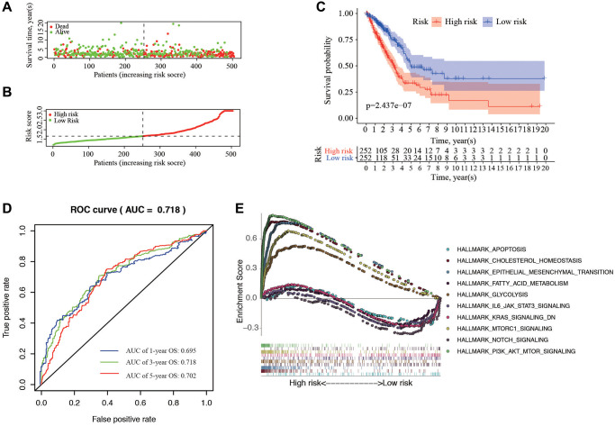
Figure 4.
Correlation between the risk score and overall survival. (A, B) Distribution of risk score and patient survival status of LUAD. (C) The Kaplan–Meier curve demonstrates that patients in the high-risk group have a poorer prognosis. (D) Time-dependent ROC curve of 1-, 3-, and 5-year analysis for survival prediction by the risk score. (E) Hallmark analysis of Gene Set Enrichment Analysis (GSEA) in high-risk and low-risk groups.

