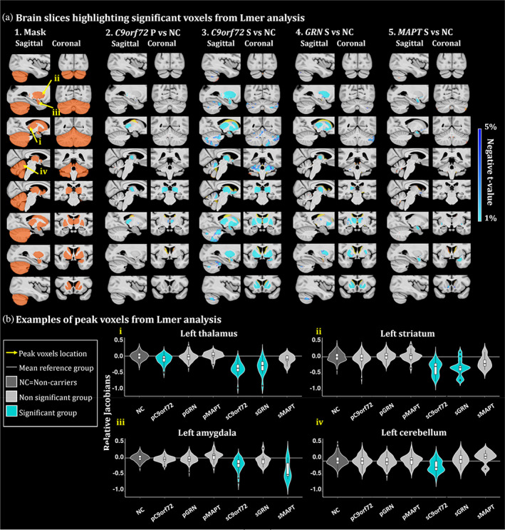
FIGURE 2.

(a) Brain slices of the brain highlighting significant group differences from the lmer analyses. t‐value maps correspond to significant p‐values between 5% and 1% after FDR correction. Axial slices represented from left to right and coronal slices represented from posterior to anterior. The t‐statistics color maps for the significant expansion are in yellow to red and for the significant contraction are in turquoise to blue. Yellow arrows were used to highlight the peak voxels selected for the plots in Figure 2b. A1. Sagittal and coronal slices of the mask used to focus the analyses in the regions of interest. Slices of the brain showing significant differences between the relative Jacobians of the A2. presymptomatic (P) C9orf72 carriers; A3. symptomatic (S) C9orf72 carriers; A4. symptomatic GRN carriers and A5. MAPT carriers versus the relative Jacobians of the noncarrier participants. (b) Examples of peak voxels from lmer analyses. White horizontal line highlights the mean relative Jacobian of the reference group (i.e., noncarrier participants). Violin plots illustrate the group difference of a peak voxel in the i. left thalamus, ii. left striatum, iii. left amygdala and iv. left cerebellum.
