. 2023 Apr 12;131(4):047009. doi: 10.1289/EHP11896

Figure 4.

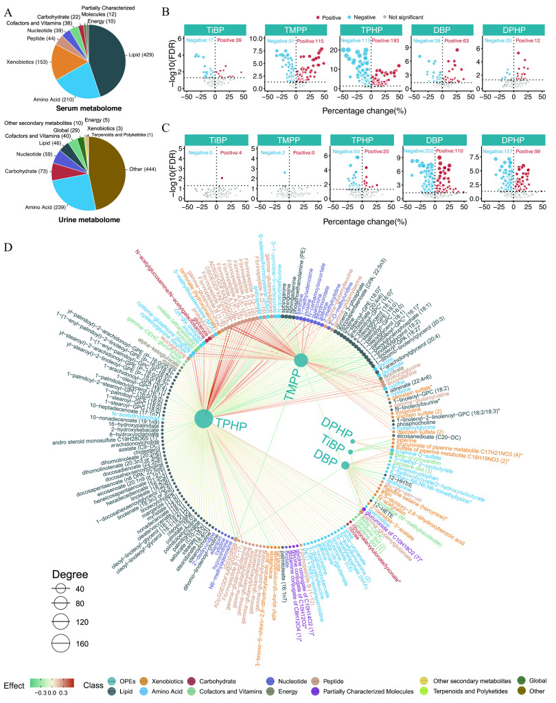
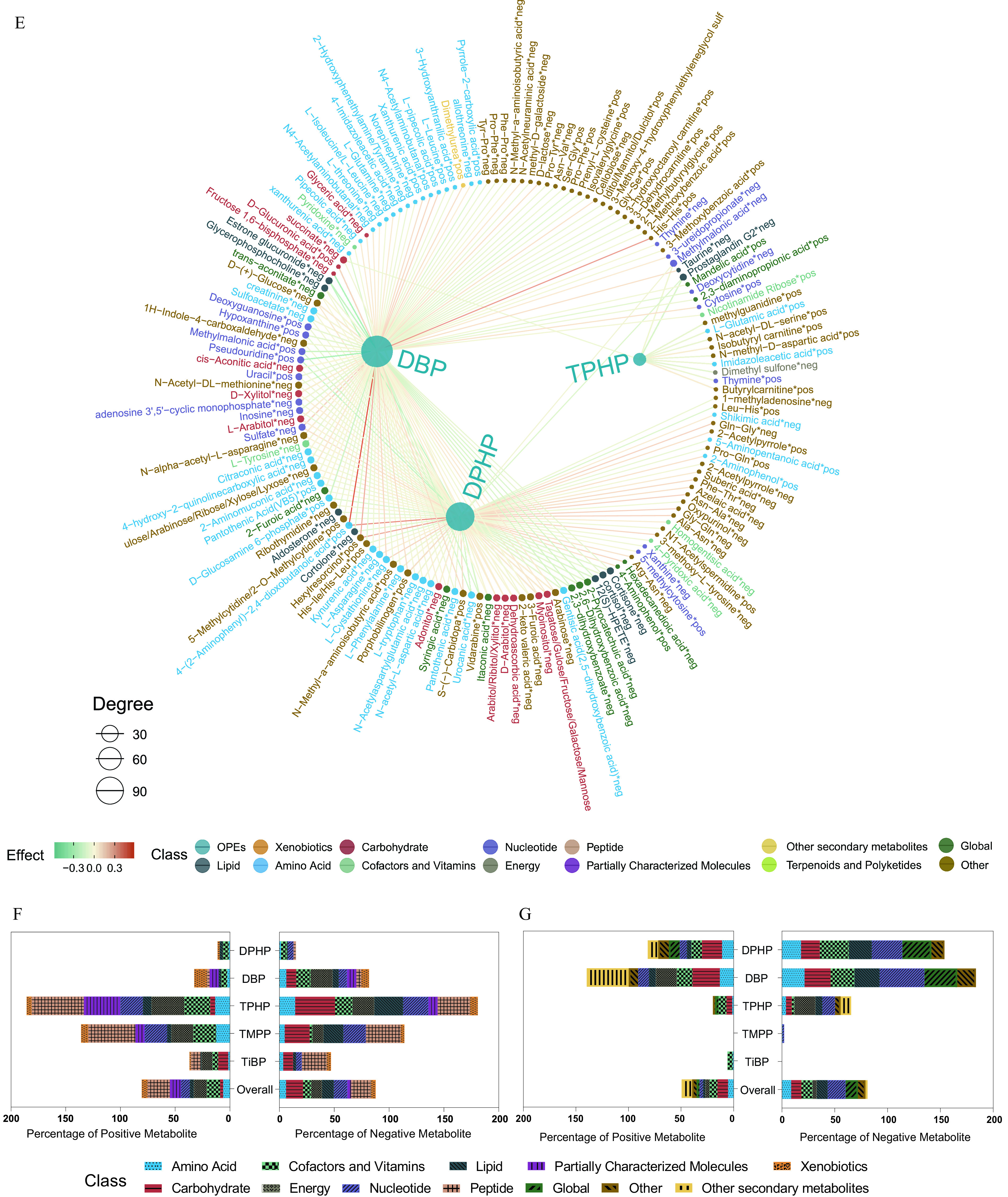
Figure 4A is set of two pie charts. The first pie chart is titled Serum metabolome and displays the following information: Lipid count is 429, amino acid count is 210, xenobiotics count is 153, peptide count is 44, nucleotide count is 39, cofactors and vitamins count is 38, carbohydrate count is 22, partially characterized molecules count is 12, and energy count is 10. The second pie chart is titled Urine metabolome and displays the following information: amino acid count is 239, carbohydrate count is 73, nucleotide count is 59, lipid count is 46, cofactors and vitamins count is 40, global count is 29, other secondary metabolites count is 10, energy count is 5, xenobiotics count is 3, terpenoids and polyketides count is 1, and other count is 444. Figure 4B is a set of five volcano plots titled T I B P, T M P P, T P H P, D B P, and D P H P, plotting negative log 10 of false discovery rate, ranging from 0 to 6 in increments of 2; 0.0 to 10.0 in increments of 2.5; 0 to 20 in increments of 10; 0 to 9 in increments of 3; and 0 to 6 in increments of 2 (y-axis) across percentage changes (percent), ranging from negative 50 to 50 in increments of 25 (x-axis) for positive, negative, and not significant. Figure 4C is a set of five volcano plots titled T I B P, T M P P, T P H P, D B P, and D P H P, plotting negative log 10 of false discovery rate, ranging from 0 to 5 in unit increments; 0 to 5 in unit increments; 0 to 6 in increments of 2; 0 to 9 in increments of 3; and 0.0 to 7.5 in increments of 2.5 (y-axis) across percentage changes (percent), ranging from negative 50 to 50 in increments of 25 (x-axis) for positive, negative, and not significant. Figure 4D is a network diagram depicting the association between exposure to the key organophosphate esters, including T P H P, T M P P, D P H P, T I B P, and D B P, and the serum or urine metabolome. The size of the node represents the degree, including 40, 80, 120, and 160, of the exposure–metabolite connection, and the shade of the edge represents the coefficient estimate of the exposure–metabolite association. The scale depicts effects ranging from negative 0.3 to 0.3 in increments of 0.3. The class includes organophosphate esters, xenobiotics, carbohydrate, nucleotide, peptide, other secondary metabolites, global, lipid, amino acid, cofactors and vitamins, energy, partially characterized molecules, terpenoids and polyketides, and other. Figure 4E is a network diagram depicting the association between exposure to the key organophosphate esters, including T P H P, D P H P, and D B P, and the serum or urine metabolome. The size of the node represents the degree, including 30, 60, 90, of the exposure–metabolite connection, and the shade of the edge represents the coefficient estimate of the exposure–metabolite association. The scale depicts effects ranging from negative 0.3 to 0.3 in increments of 0.3. The class includes organophosphate esters, xenobiotics, carbohydrate, nucleotide, peptide, other secondary metabolites, global, lipid, amino acid, cofactors and vitamins, energy, partially characterized molecules, terpenoids and polyketides, and other. Figures 4F and 4G, each are a set of two horizontal stacked bar graphs, Overall, T i B P, T M P P, T P H P, D B P, D P H P (y-axis) across percentage of positive metabolite, ranging from 200 to 0 in decrements of 50 and percentage of negative metabolite, ranging from 0 to 200 in increments of 50 (x-axis) for class, including Amino Acid, Cofactors and Vitamins, Lipid, Partially Characterized Molecules, Xenobiotics, Carbohydrate, Energy, Nucleotide, Peptide, Global, Other, and Other secondary metabolites.

Figure 4A is set of two pie charts. The first pie chart is titled Serum metabolome and displays the following information: Lipid count is 429, amino acid count is 210, xenobiotics count is 153, peptide count is 44, nucleotide count is 39, cofactors and vitamins count is 38, carbohydrate count is 22, partially characterized molecules count is 12, and energy count is 10. The second pie chart is titled Urine metabolome and displays the following information: amino acid count is 239, carbohydrate count is 73, nucleotide count is 59, lipid count is 46, cofactors and vitamins count is 40, global count is 29, other secondary metabolites count is 10, energy count is 5, xenobiotics count is 3, terpenoids and polyketides count is 1, and other count is 444. Figure 4B is a set of five volcano plots titled T I B P, T M P P, T P H P, D B P, and D P H P, plotting negative log 10 of false discovery rate, ranging from 0 to 6 in increments of 2; 0.0 to 10.0 in increments of 2.5; 0 to 20 in increments of 10; 0 to 9 in increments of 3; and 0 to 6 in increments of 2 (y-axis) across percentage changes (percent), ranging from negative 50 to 50 in increments of 25 (x-axis) for positive, negative, and not significant. Figure 4C is a set of five volcano plots titled T I B P, T M P P, T P H P, D B P, and D P H P, plotting negative log 10 of false discovery rate, ranging from 0 to 5 in unit increments; 0 to 5 in unit increments; 0 to 6 in increments of 2; 0 to 9 in increments of 3; and 0.0 to 7.5 in increments of 2.5 (y-axis) across percentage changes (percent), ranging from negative 50 to 50 in increments of 25 (x-axis) for positive, negative, and not significant. Figure 4D is a network diagram depicting the association between exposure to the key organophosphate esters, including T P H P, T M P P, D P H P, T I B P, and D B P, and the serum or urine metabolome. The size of the node represents the degree, including 40, 80, 120, and 160, of the exposure–metabolite connection, and the shade of the edge represents the coefficient estimate of the exposure–metabolite association. The scale depicts effects ranging from negative 0.3 to 0.3 in increments of 0.3. The class includes organophosphate esters, xenobiotics, carbohydrate, nucleotide, peptide, other secondary metabolites, global, lipid, amino acid, cofactors and vitamins, energy, partially characterized molecules, terpenoids and polyketides, and other. Figure 4E is a network diagram depicting the association between exposure to the key organophosphate esters, including T P H P, D P H P, and D B P, and the serum or urine metabolome. The size of the node represents the degree, including 30, 60, 90, of the exposure–metabolite connection, and the shade of the edge represents the coefficient estimate of the exposure–metabolite association. The scale depicts effects ranging from negative 0.3 to 0.3 in increments of 0.3. The class includes organophosphate esters, xenobiotics, carbohydrate, nucleotide, peptide, other secondary metabolites, global, lipid, amino acid, cofactors and vitamins, energy, partially characterized molecules, terpenoids and polyketides, and other. Figures 4F and 4G, each are a set of two horizontal stacked bar graphs, Overall, T i B P, T M P P, T P H P, D B P, D P H P (y-axis) across percentage of positive metabolite, ranging from 200 to 0 in decrements of 50 and percentage of negative metabolite, ranging from 0 to 200 in increments of 50 (x-axis) for class, including Amino Acid, Cofactors and Vitamins, Lipid, Partially Characterized Molecules, Xenobiotics, Carbohydrate, Energy, Nucleotide, Peptide, Global, Other, and Other secondary metabolites.

Serum and urine metabolome profiling of exposure to the key OPEs among healthy older Chinese adults 60–69 years of age. (A) The number of endogenous metabolites based on metabolic classifications in the serum and urine. (B,C) Volcano plots of the coefficient estimates of the key OPEs vs. the FDR values in the associations of the exposure–serum metabolome (B; see also Excel Table S6) and exposure–urine metabolome (C; see also Excel Table S7). Coefficient estimates are expressed as percentage changes (%) in FPG, GSP, FINS, and HOMA-IR per 1-SD change in each exposure, which was previously transformed to approach normality. The dashed horizontal line shows where the FDR value equals 0.05. (D,E) Network diagram of the association analysis between exposure to the key OPEs and the serum/urine metabolome (only metabolites with associations of FDR <0.001 are shown; see also Excel Tables S6 and S7). The size of the node represents the degree of the exposure–metabolite connection, and the color of the edge represents the coefficient estimate of the exposure–metabolite association. (F,G) Stacking histograms of the percentages (%) of positively and negatively associated metabolites within each class, as well as the overall average for the serum and urine metabolomes with an FDR value of <0.05 (see also Tables S5 and S6). Note: FDR, false discovery rate; FINS, fasting insulin; FPG, fasting plasma glucose; GSP, glycated serum protein; HOMA-IR, homeostatic model assessment for insulin resistance; OPE, organophosphate ester; SD, standard deviation.