Figure 5.
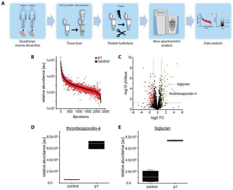
Proteomic studies on a muscle biopsy derived from a BICD2-patient (p1): (A) Schematic representation of the applied workflow. (B) Abundance plot for proteomic profiling data obtained on quadriceps muscle showing the dynamic range of all identified proteins. This is based on their relative quantification of the three highest abundant peptides for each protein, allowing protein comparison within an experiment. All identified proteins of the control (black) are sorted with decreasing abundance while the patient (red) was plotted in the same order to directly compare the different abundances. All identified proteins cover a dynamic range of eight orders of magnitude. (C) Volcano plot for proteomic findings obtained in quadriceps muscle highlighting statistically significant increased proteins (green dots) as well as decreased proteins (red dots). FC = fold change. (D,E) Boxplots of the abundance for thrombospondin-4 and biglycan in muscle. Relative abundance was measured in two healthy controls and p1 in triplicates each. Mean values with standard deviation are displayed.

