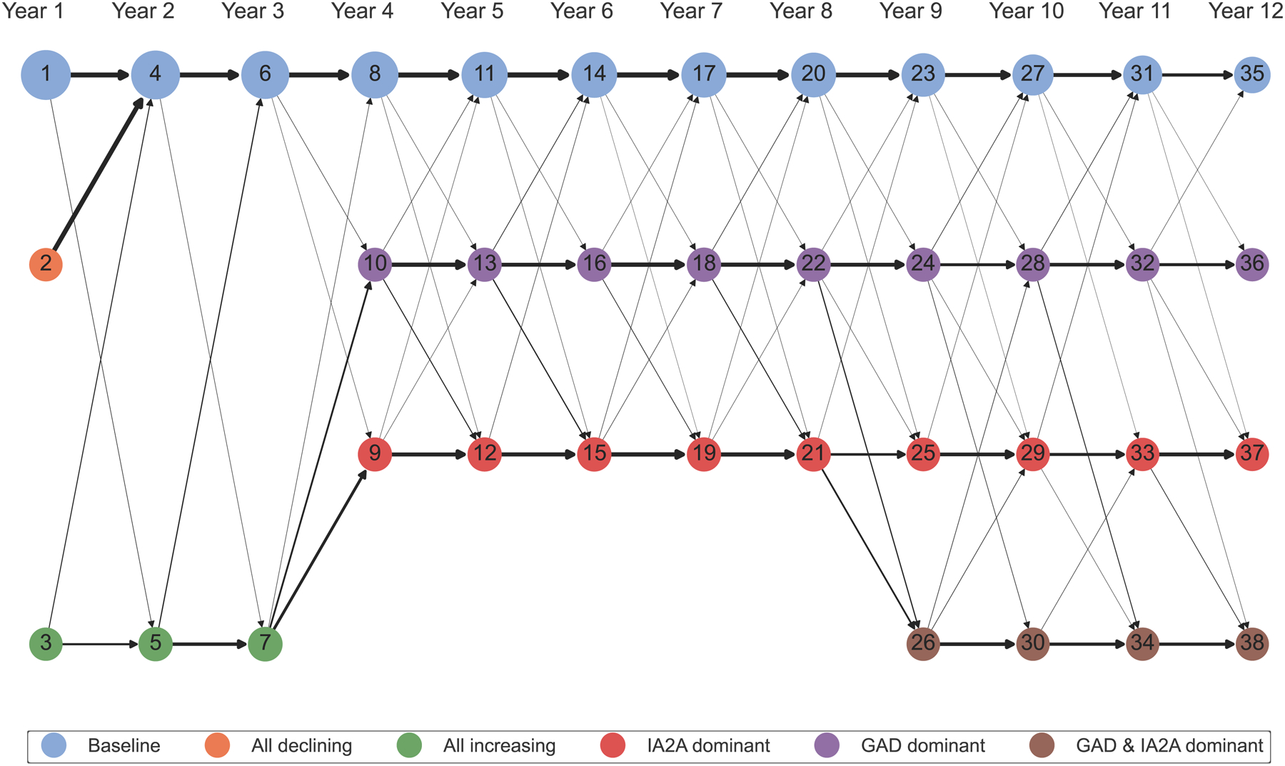
Figure 6: Transitions in cluster membership across years 1 – 12:

Network diagram of transitions in cluster membership across Years 1 – 12. The nodes represent cluster membership in each year and are colored according to the autoantibody cluster center: baseline (blue), all declining (orange), all increasing (green), IA-2A dominant (red), GADA dominant (purple), or IA-2A and GADA dominant (brown). The numbers in the nodes represent cluster number. The size of the node correlates to the scaled number of individuals assigned to that cluster. The black arrows represent the scaled number of participants that transitioned from a given cluster to a different cluster in the subsequent year.
