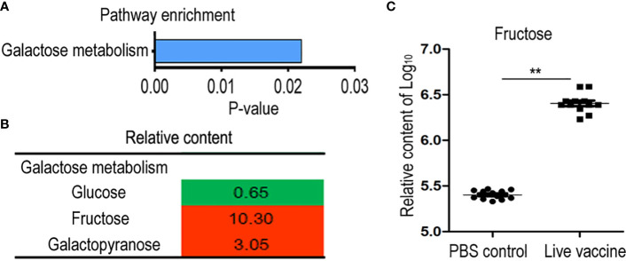
Figure 4.
Metabolomics analysis of enriched pathway. (A) Pathway enrichment of different metabolites in live group. (B) Integrative analysis of metabolites in enriched pathways. The value was relative content in the live groups compared with control group. Red color and green color indicate increased and decreased metabolites, respectively. (C) The scatter diagram of different metabolite. The Y-axis is relative content of metabolites. **, P <0.01 using the Chi-square test.

