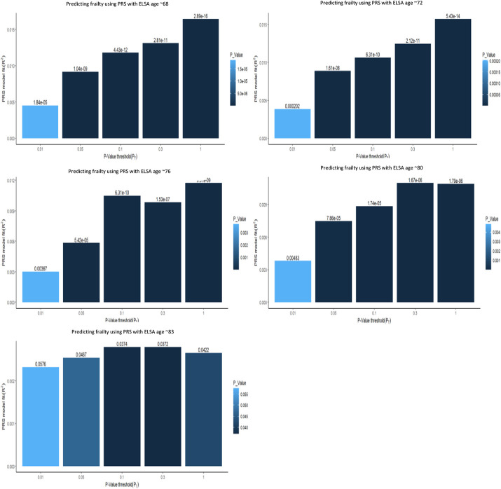
Figure 2.
Multiple bar plots, from the multiple regression models, showing the optimal p-value thresholds when predicting frailty using PGS at five time points the ELSA. The x axis displays the varying different p-value threshold levels. The y axis displays the variance explained by the PGS. The values above the bar are the p-values from the regression output. The darker and taller the bar the stronger the prediction of the frailty PRS.

