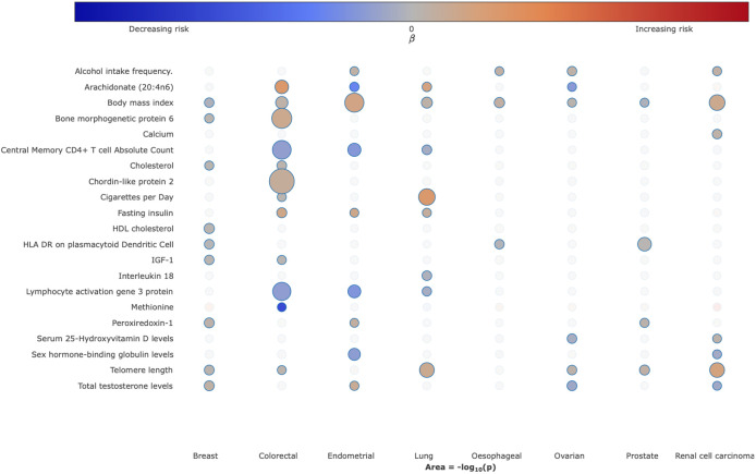
Figure 3. Bubble plot of the causal relationship between selected traits and risk of different cancers.
Each column corresponds to cancer type. Colours on the heatmap correspond to the strength of associations (odds ratio) and their direction (red positively correlated, blue negatively correlated), the size of each node corresponding to the −log10 P-value, with increasing size indicating a smaller P-value. In the available R/Shiny app (https://mrcancer.shinyapps.io/mrcan/), moving the cursor to each bubble will reveal the underlying MR statistics.

