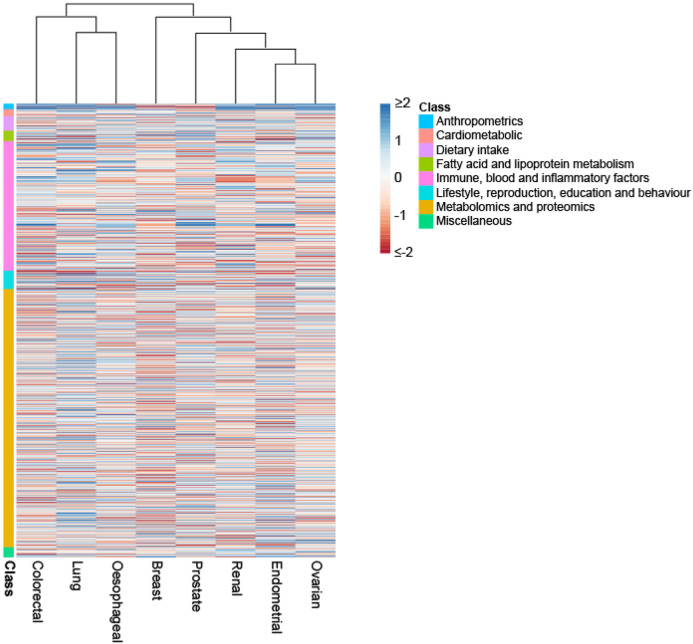
Figure 5. Heatmap and dendrogram showing clustering of causal associations between traits and cancer risk.
Heatmap based on Z-statistics using the clustering method implemented in the pheatmap function within R. Colours correspond to the strength of associations and their direction (red positive association with risk, blue inverse association with risk). Trait classes are annotated on the left. Only traits showing an association for at least one cancer type are shown.

