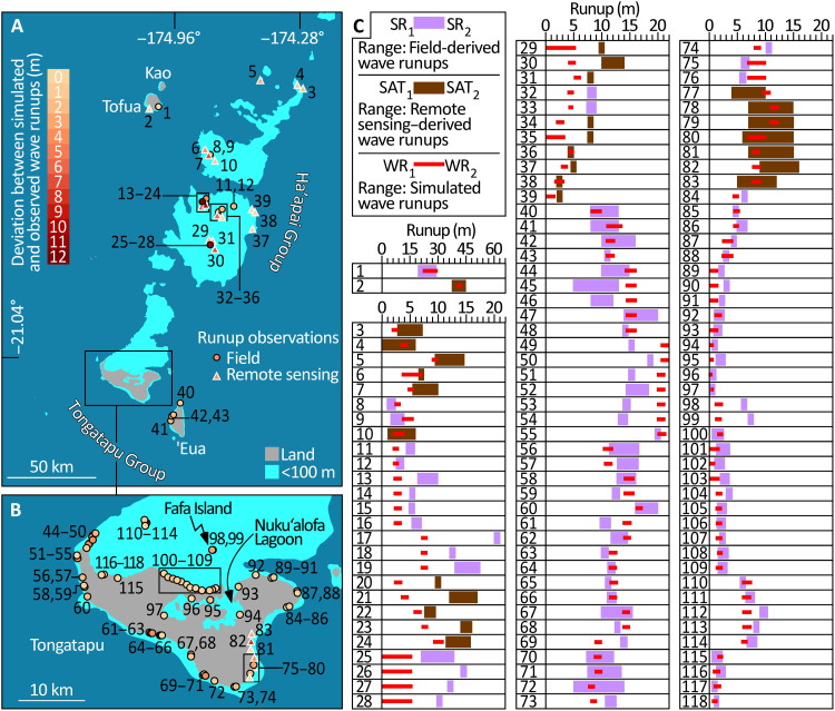
Fig. 7. Comparison of simulated and observed wave runups at 118 sites.
ID numbers relate the sites mapped in (A) and (B) to the comparisons of observed versus simulated data graphed in (C). In the maps, sites where runups were observed in the field are depicted by circles, and those observed using time-separated remote sensing are triangles. These symbols are color-coded to depict the discrepancy between observed runups and those predicted by tsunami simulation. In (C), purple and brown bars represent runup observations made in the field and made using remote sensing, respectively. Runups from the tsunami simulation are red bars. In each case, the bars span two estimates of observed and simulated runup at each site (Materials and Methods for details).

