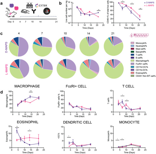
Figure 2.

Macrophages and FcεRI+ cells dominated the immune cell infiltration. a) Scheme illustrating the experiment timeline. After the initial injections, implant extraction and flow cytometry were performed at designated time points (days 4, 7, 10, 14, 21). b) The total number of live cells (Zombie NIR‐), the total number of live immune cells (CD45+), and their percentage among all live cells [monocyte (CD45+FceR1‐MHCII‐), neutrophil (CD45+Ly6G+), mast cells (CD45+CD117+FceR1‐CD11b‐CD11c‐), basophil (CD45+CD117‐FceR1‐CD11b‐CD11c‐), T cell (CD45+MHCII‐CD24‐Ly6G‐CD11b‐CD11c‐FceR1‐) B cell (CD45+MHCII+CD24+Ly6G‐CD11b‐CD11c‐FceR1‐), macrophage (CD45+FceR1‐MHCII±CD64+), FcεRI+ cells, CD11b+DC (CD45+Ly6G‐FceR1‐CD11b+MHCII+), CD11b‐DC (CD45+Ly6G‐FceR1‐CD11b‐MHCII+), Eosinophil (CD45+Ly6G‐FceR1‐CD11b+MHCII‐), and CD24+ non B/T cell (CD45+CD24+MHCII‐Ly6G‐CD11b‐CD11c‐FceR1‐)]. c) Pie charts of myeloid cell abundance across 5 time points for both D‐MAPS and L‐MAPS. Each number was an average of the results from 5 mice. d) Macrophage, FcεRI+ cell, T cell, eosinophil, CD11b+ dendritic cell, monocyte percentages among all CD45+ live cells. Statistical analysis: two‐way ANOVA with Šídák's multiple comparisons test made between L‐ and D‐MAPS groups only when there was a significance in the interaction term of scaffold type x time. ∗ p < 0.05, ∗∗ p < 0.001, ∗∗∗ p < 0.001. Error bars, mean ± s.e.m. n = 5 mice per group. The pink symbol in the middle right of the graph stands for the 11‐color innate cell panel used in this figure.
