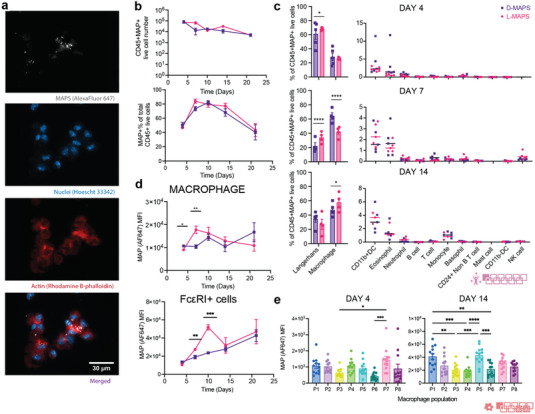
Figure 4.

Infiltrated cells internalized MAPS throughout the implantation. a) Zeiss image of cells extracted from the implants showing MAPS internalization (scale bar, 30 µm); b) the total number of CD45+MAPS+ live cells and their percentage among all CD45+ live cells. c) MAPS+ immune cell abundance across 5 time points for both D‐ and L‐MAPS. d) MFI of AF647 (ingested MAPS) in macrophage and FcεRI+ cell over time. e) MFI of AF647 (amount of internalized MAPS) in each macrophage combining results from both L‐ and D‐MAPS at days 4 and 14. Day 7 was omitted in the plot since MFI AF647 expression was negligible for all populations. Statistical analysis: two‐way ANOVA with Šídák's multiple comparisons test made between L‐ and D‐MAPS groups only when there was a significance in the interaction term of scaffold type x time. ∗ p < 0.05, ∗∗ p < 0.001, ∗∗∗ p < 0.001. Error bars, mean ± s.e.m. n = 5 mice per group for (b–d) and n = 15 for (e) with some data points removed due to experimental reasons. The pink symbol in the middle right of the graph stands for the 11‐color innate cell panel used in panels (b, c) of this figure. The red symbol in the bottom right corner of the graph stands for the 9‐color macrophage panel used in this figure.
