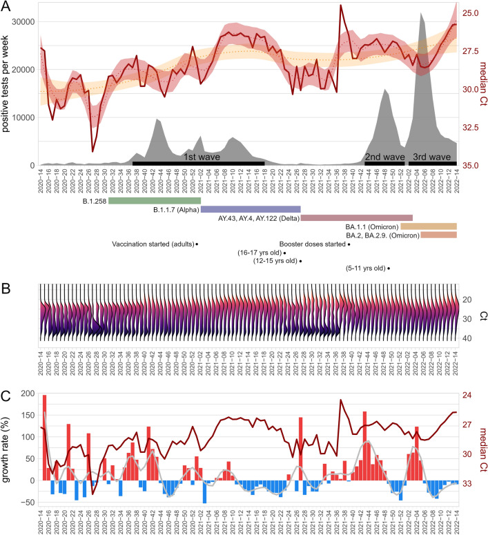
Figure 1.
(A) The time course of median Ct values per week (dark red line) and the total number of positive tests per week (grey area). Loess curves fitted to Ct medians are shown as a dotted red line (alpha = 0.15) and yellow line (alpha = 0.7). Shaded areas surrounding the curves are 0.95 confidence intervals. Black segments on the x-axis indicate major epidemics waves considered in downstream analyses. The coloured segments below the x-axis indicate the main SARS-CoV-2 variants present in the population based on publicly available data. The black dots indicate the start of vaccination. (B) Ct distributions of positive tests shown as half violin plots. (C) The time course of median Ct values per week (dark red line) and the growth rate of positive samples. The growth rate is expressed in blue for negative values (decline) and red for positive values (growth). Loess curve fitted to the growth rate is shown as a solid grey line (alpha = 0.1).

