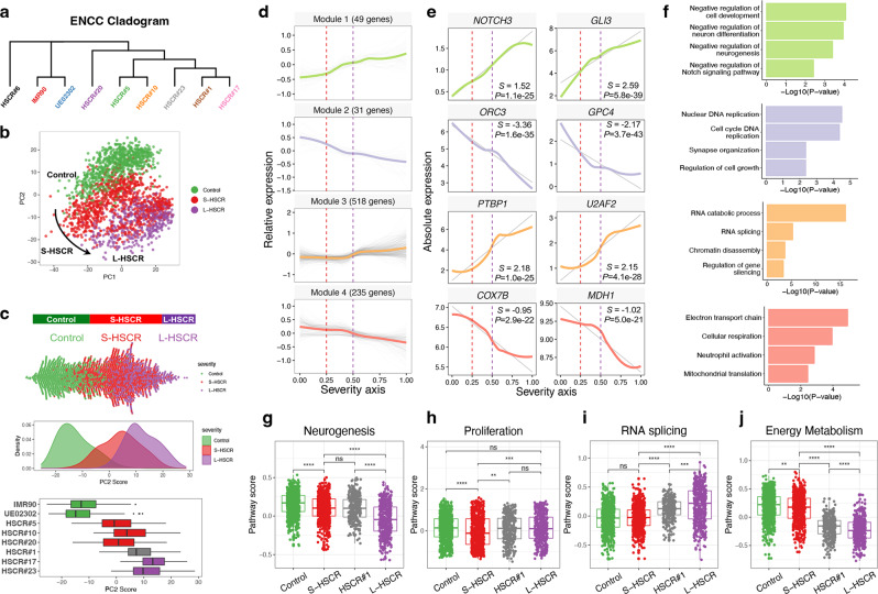
Fig. 2. Reconstruction of disease severity axis integrating different HSCR states.
a Hierarchical clustering by average gene expression. b PCA projection of cells in Cluster 1 based on gene expression profile after excluding the TCA-HSCR-iPSC-line (HSCR#6). c Distribution of cells along PC2 is highly associated with disease severity, as shown in beeswarm, density, and boxplots. Colored by type of HSCR. 379 IMR90 cells, 375 UE02302 cells, 161 HSCR#5 cells, 296 HSCR#10 cells, 186 HSCR#20 cells, 306 HSCR#1 cells, 187 HSCR#17 cells, and 246 HSCR#23 cells were included. d The expression dynamics of 833 top DEGs were cataloged into four major modules, colored by modules. Thick lines indicate the average gene expression patterns of each module. All 2136 cells ordered by severity axis were included to fit the expression curve. e Gene signatures and expression dynamics of representative genes in each gene module. The relative expression levels of these genes are shown as a LOESS smooth fit line (colored line) and the best-fit lines (gray lines) in linear regression. S slope, P P value of linear regression. f Gene ontology analyses of each gene module. P value and FDR were calculated by clusterProfiler software. g–j Overall pathway scores of neurogenesis, proliferation, RNA splicing, and energy metabolism. A two-sided Wilcoxon rank-sum test was applied to calculate the significance of the difference between the two groups. All samples (two controls with 754 cells, three S-HSCR with 643 cells, intermediated HSCR#1 with 306 cells, and two L-HSCR with 433 cells) were included for comparison and presented as groups. Tests marked by “****”, “***”, “**”, and “*” represent they are statistically different from the controls of P values <0.0001, <0.001, <0.01, and <0.05, respectively. ns not significantly different. In all the boxplots, each box represents the interquartile range (IQR, the range between the 25th and 75th percentile) with the mid-point of the data, whiskers indicate the upper and lower value within 1.5 times the IQR.

