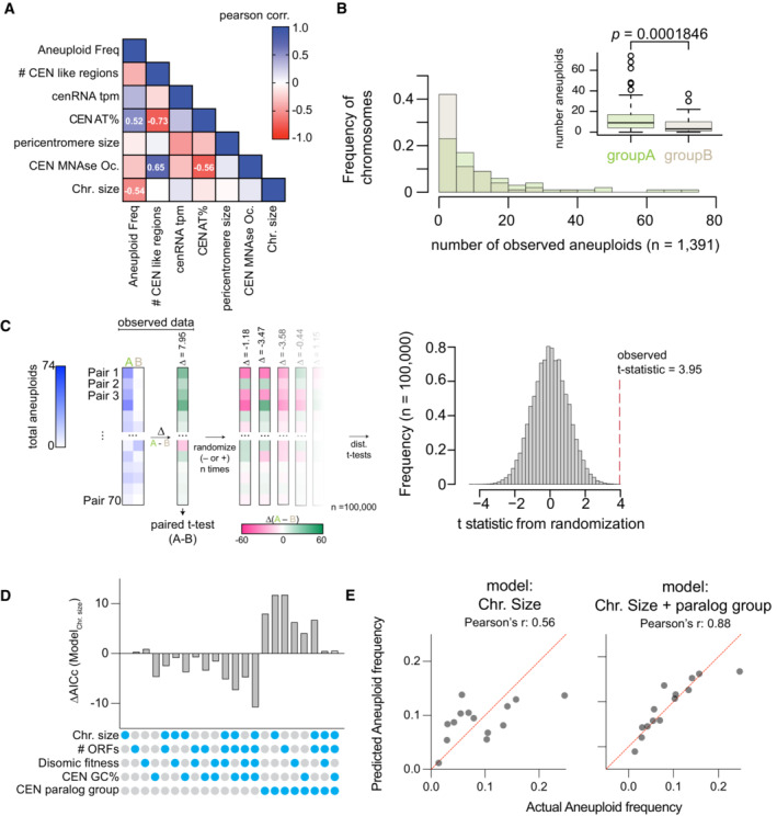
Randomizations of the mean difference in aneuploidy occurrence between centromere paralog pairs. Left panel, schematic of the analysis. Briefly, we examined the mean difference in aneuploidy frequency between centromere paralog pairs (Group A—Group B, e.g., CEN1—CEN7) in our study and nine additional studies (Table
EV3; Kao
et al,
2010; McCulley & Petes,
2010; Selmecki
et al,
2015; Gallone
et al,
2016; Zhu
et al,
2016; Jaffe
et al,
2017; Duan
et al,
2018; Peter
et al,
2018; Sharp
et al,
2018). Next, from these 70 paired aneuploid values (note, we excluded the comparison of pair CEN15‐CEN13), we calculated the difference in aneuploidy occurrence between each group A and group B pairs. We then performed a paired t‐test on the mean difference in aneuploid occurrence between group A and group B pairs (
t = 3.95,
P = 0.0001846). To evaluate how “extreme” the observed
t‐statistic is, we performed randomized allocations of the observed differences in aneuploid occurrence. Succinctly put, we randomly assigned the sign (− or +) to the differences between group A and B paralog pairs and then calculated
t‐statistics from 100,000 randomized such allocations. The randomizations yielded a distribution of
t‐statistics of the mean difference in aneuploid occurrence between pairs assuming the null hypothesis is true (i.e., there is no difference in aneuploid frequency between the two groups). Right panel: histogram of the
t‐statistics from 100,000 randomizations of the difference in aneuploid occurrence. The observed
t‐statistic is shown with a red dashed line (
P < 0.00004).

