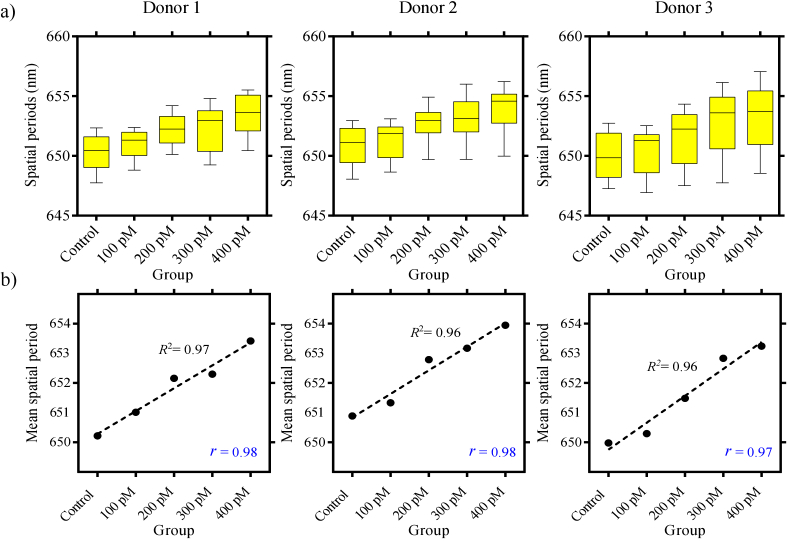
Fig. 4.
a) Three sets of box plots corresponding to three different donors (experimental group 3) are shown. The box plots are formed using mean spatial periods calculated from en face images. For each donor, there are five box plots corresponding to samples labelled with varying concentrations (unlabelled, 100 pM, 200 pM, 300 pM and 400 pM) of nanostars. All three sets of box plots show that the spatial periods tend to increase with increasing nanostar concentrations. b) We used a single mean spatial period value on the Y-axis to represent the entire sample for each group. For this purpose, we calculated the mean value from the individual box plots in (a) and applied a first-order polynomial fit. The and values are the coefficient of determination and Pearson correlation, respectively.

