
Figure 5 —
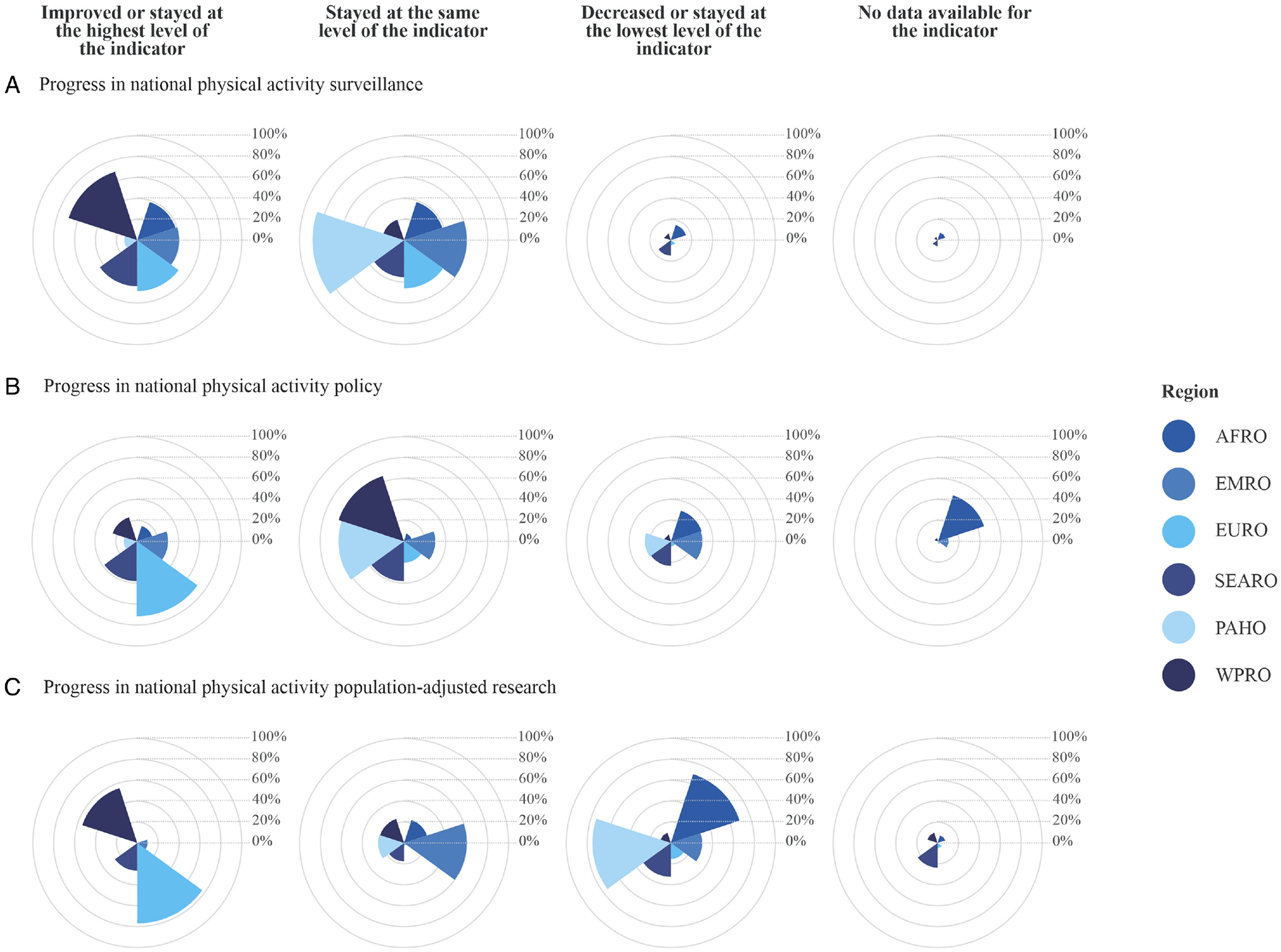
Progress in national physical activity surveillance, policy, and research by world region.
Note: The reference period was 2015–2020 for surveillance and policy and 2010–2019 for research. The inner circles in each radial plot accumulate a percentage, thus the first inner circle represents 20.0% and the last inner circle represents 100.0%. Each region is represented by a color, for example, the first radial plot (top left) shows that 69.0% of countries in the WPRO region (dark blue) improved or stayed at the highest surveillance level. AFRO indicates Africa; EMRO, Eastern Mediterranean; EURO, Europe; PAHO, The Americas; SEARO, South-East Asia; WPRO, Western Pacific.
Note: The regions from lightest to darkest on the color scale are: PAHO, EURO, EMRO, AFRO, SEARO, and WPRO. For the most accurate interpretation of this graph (full range of color) please refer to the electronic version of the manuscript.