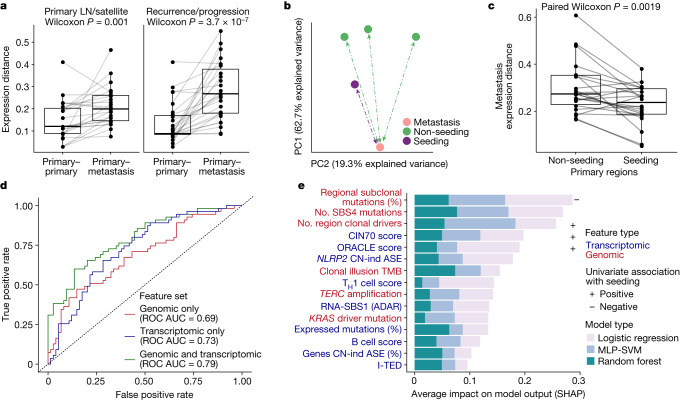
Fig. 4. Transcriptional landscape of seeding tumour regions.
a, Expression distance between primary regions compared to either metastatic LN regions or pulmonary nodules resected at the time of surgery (left) or metastatic regions resected at relapse within the same patient (right). Only tumours containing two or more regions with at least one metastatic region sampled are shown (n = 50 primary–metastasis pairs from 35 tumours). b, First two PCs for all available primary and metastatic tumour regions in an example tumour, CRUK0361, based on gene expression levels. The region containing the seeding clone was more proximal to the metastatic sample than other primary regions. c, Expression distance between metastatic samples and their paired primary samples across the cohort depending on whether the region contained a seeding clone(s). The analysis was run on 22 metastatic samples that had gene expression data for both seeding and non-seeding primary regions. d, ROC curves for ensemble models trained on each feature set: genomic only (red), transcriptomic only (blue), combined genomic and transcriptomic (green) and assessed against the held-out test dataset. The predictions are based on 516 primary tumour regions from 206 tumours for which seeding status could be established and for which all metrics tested could be measured (307 non-seeding regions, 209 seeding), with a 75/25% training/test dataset split. e, Mean Shapley additive explanations (SHAP) values (calculated across the held-out test dataset) for each feature in the combined ensemble model, capturing the importance of each feature for model prediction. Label colours indicate the feature type, genomic (red) or transcriptomic (blue), and box colours indicate the model type from which the SHAP values were extracted. The symbols at the end of the bars indicate either a significantly positive (+) or negative (–) association, with increased weight for seeding potential based on a two-sided Wilcoxon test comparing seeding to non-seeding regions. MLP-SVM, multilayer perceptron with support vector machine. All box plots in this figure represent the lower quartile, median and upper quartile, whiskers represent lower and higher bound ±1.5× interquartile range. All Wilcoxon tests shown here (paired or unpaired) were two sided.

