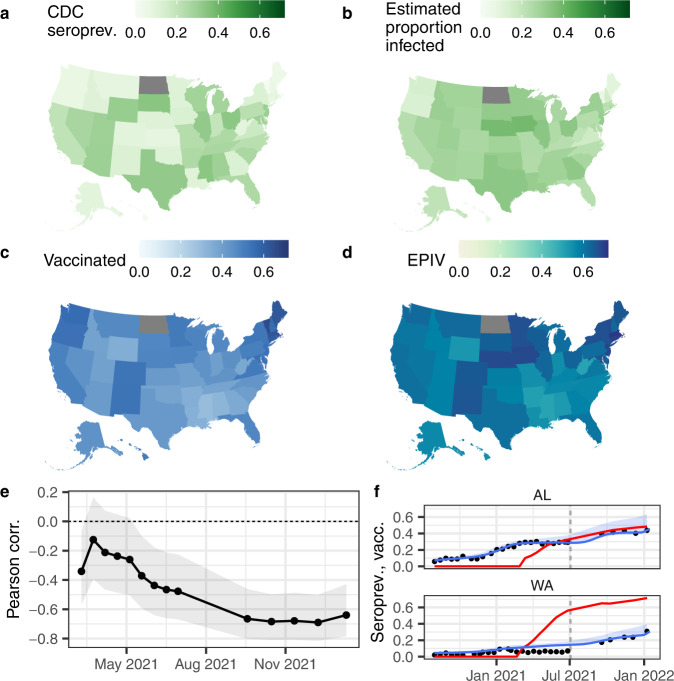
Fig. 4. Spatial patterns and correlations.
Spatial variation in July 2021 (round 24) in (a) CDC nationwide serosurvey seroprevalence, (b) estimated proportion infected, (c) proportion of the population with a complete series of a vaccine, (d) estimated proportion infected and/or vaccinated (EPIV; assuming independent probabilities of having had a natural infection and being vaccinated), (e) round-by-round Pearson correlation between the proportion of the population vaccinated and the estimated proportion infected (shaded areas show the 95% uncertainty intervals for a two-sided test), and (f) example time series of seroprevalence estimates (black points), estimated proportion infected (blue lines; shaded areas show the uncertainty envelopes due to the uncertainty in the model fit and in the selection of times to seroreversion and lead or lag between seroprevalence and reported cases), and proportion of the population vaccinated with a full series (red lines) for two states. a–d show maps for July 2021 (round 24); its point in time is shown in (f) as vertical gray dashed lines. In (e), a negative correlation means that states with a higher vaccination coverage tended to be those with lower proportion infected. See Supplementary Fig. 9 for time series like those in (f) for all states.

