
FIGURE 5.
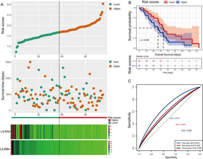
Visualisation for a prognostic model, Kaplan–Meier plot for the risk scores group, and an ROC curve for the effective power of the OS prognostic model. (a) From top to bottom: risk scores map, survival scatterplot, the heat map of the expression of LILRA4 and LILRB4 lower and higher groups; red represents upregulation; blue represents downregulation. (b) A Kaplan–Meier plot for the risk score group. (c) The ROC curve for the OS prognostic model.