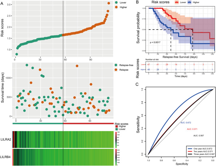
FIGURE 6.

Visualisation of the prognostic model, a Kaplan–Meier plot for the risk scores group, and an ROC curve for the effective power of the RFS prognostic model. Using the median expression of each LILR gene as the cut‐off point, we defined the higher and lower risk groups for PDAC. (a) From top to bottom: risk scores map, survival scatterplot, the heat map of expression of LILRA2 and LILRB4 lower and higher groups; red represents upregulation; blue represents downregulation. (b) Kaplan–Meier plot for the risk score group. (c) The ROC curve for the RFS prognostic model.
