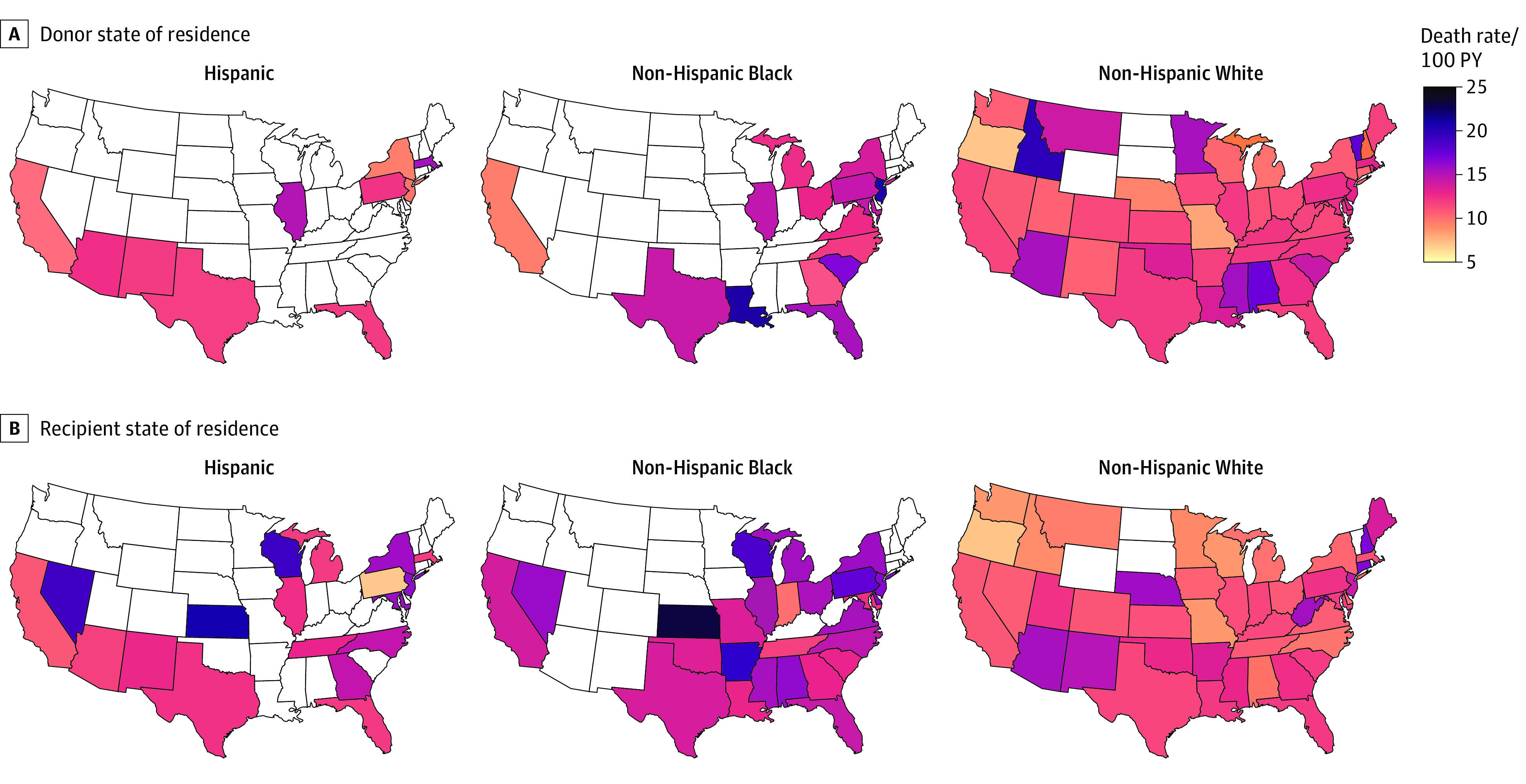
Figure 3. Posttransplant Recipient Death Rates by Donor and Recipient State of Residence.

Maps presented by donor (A) and recipient (B) race and ethnicity. Deaths represented as rates per 100 person-years (PY). Data are suppressed for states with 10 or fewer donors (A) or recipients (B).
