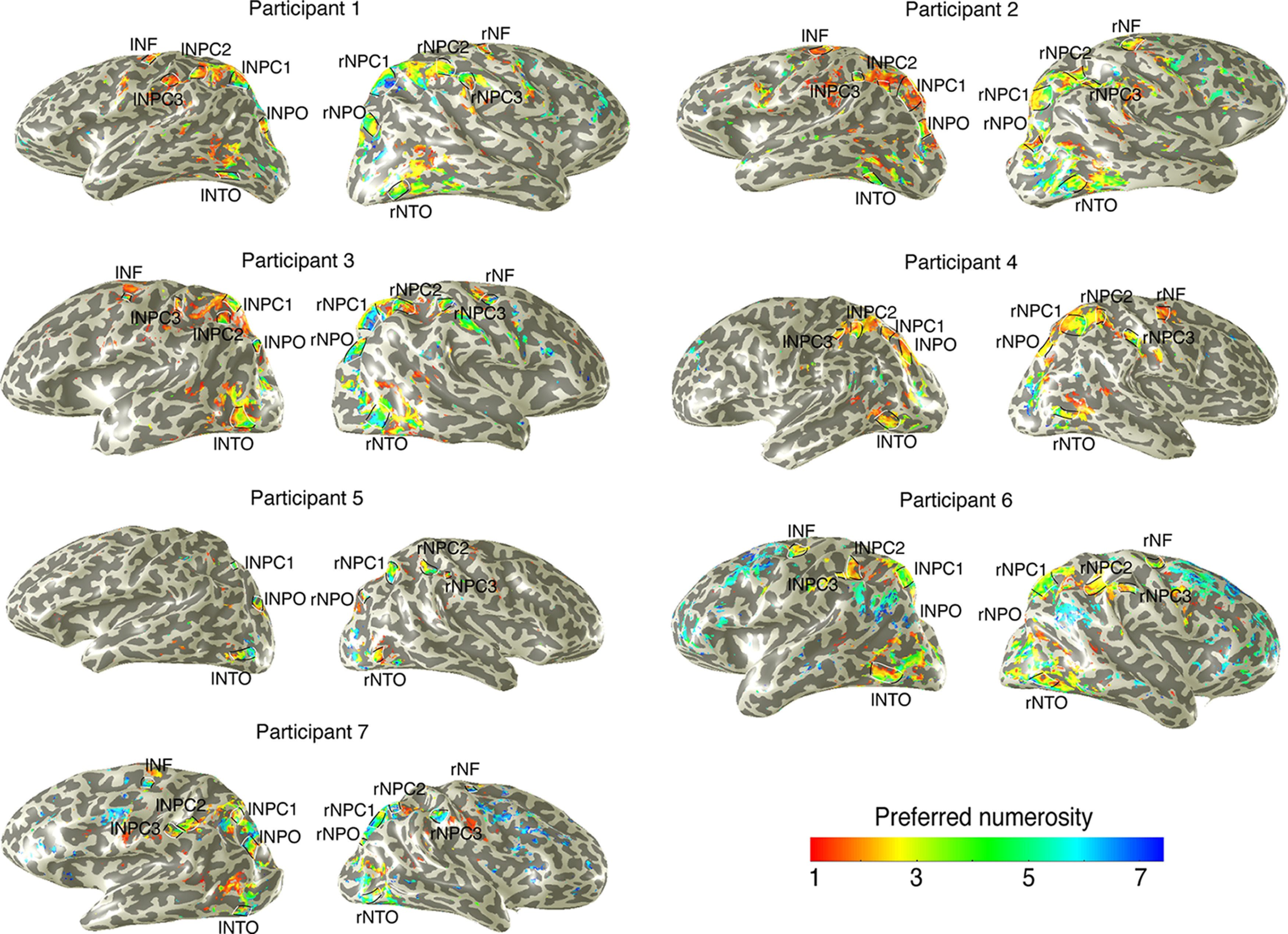
Figure 2.

Cortical rendering of topographic numerosity maps of each participant. An example of preferred numerosity estimates in 1 participant for the left and right hemispheres. Black lines outline the edge borders of individual numerosity maps. White lines indicate the lowest and highest preferred numerosities in each map. The map of preferred numerosity estimates is thresholded at a variance explained of 30%. The numerosity maps served as independent ROIs in the symbolic number experiments.
