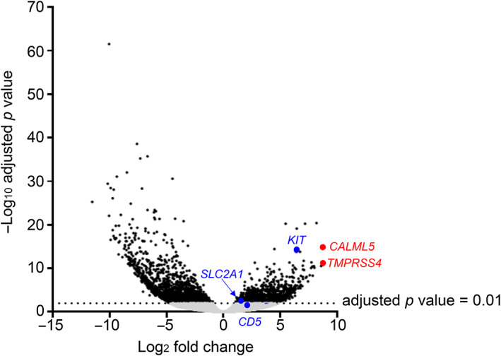
FIGURE 1.

Promoter‐level expression analyses between thymic squamous cell carcinoma and type B3 thymoma. The log2‐fold change in the average expression levels in count per million (CPM) (x‐axis) is plotted against the −log10 adjusted p‐value. Individual dots represent the activities of individual promoters, and the gray dots indicate an adjusted p‐value of 0.01 or higher, and black dots indicate an adjusted p‐value of less than 0.01, and blue dots indicates known markers, and red dot indicates a novel candidate.
