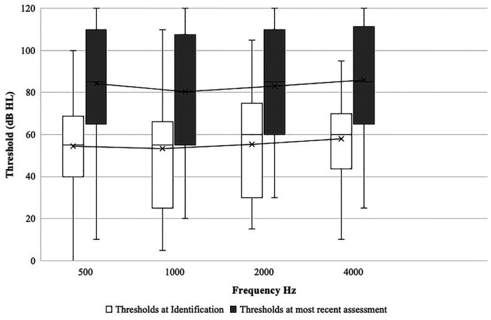
Figure 2.
Average change in hearing thresholds across frequencies from initial diagnosis to most recent assessment (n = 77). The boxes indicate the 25th, 50th, and 75th percentiles. The whiskers above and below the box boundaries show the largest and smallest observed values. x on graph refers to mean thresholds.

