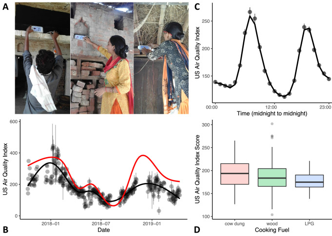
Figure 2. Variations in in-home air quality (PM2.5) by year, by day, and by type of cooking fuel.
(A) Three examples of in-home sensor placement for households of varying SES levels. (B) Variations in in-home air quality over years in the study (participants contributing data = 215). Black dots show mean air quality index over each 3-day assessment period with standard errors indicating variability over households collected on the same day. Black line shows our model fit through these data. Red line shows best-fitting curve from outdoor air quality observations recorded in Lucknow, India. (C) Daily variations in in-home air quality with peaks at meal preparation times (participants contributing data = 215). Points indicate raw data (with standard errors), the line indicates our model fit. (D) Plots showing poorer in-home air quality for households that used cow dung for cooking fuel (N = 25) relative to wood (N = 152) and liquified petroleum gas (LPG; N = 38). Boxplot details are same as in Figure 1.

