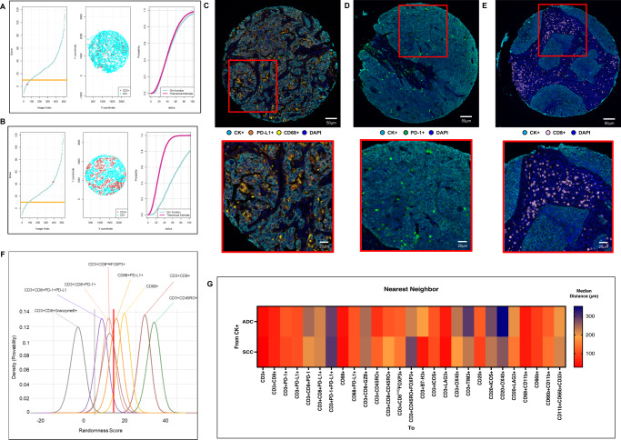
Fig. 3. Nearest neighbor distance G function and theoretical Poisson curve score graphs showing different cellular patterns of distance from cytokeratin + cells (malignant cells) to CD3 + T-cells, and heat map representing distance patterns by histologic type.
A, B Representative example of the scoring system across tissue specimens and threshold to be considered part of the mixed (A) or unmixed (B) pattern. Graphs represent the scoring system (left), point pattern distributions related to the major T-cell population (middle), and G function and theoretical Poisson curve area (right). Composite spectral mixing images from multiplex immunofluorescence (mIF; 20× magnification, scale bars represent 50 µm on each image) showing a representative image of mixed pattern of macrophages PD-L1 expression (C) and PD-1+ antigen experience T-cells (D), in the bottom inside detail of the pattern (mIF; 40× magnification, scale bars represent 20 µm on each image). Unmixed pattern of CD8 + cytotoxic T-cells (E) and in their bottom inside detail of the pattern (mIF; 40× magnification, scale bars represent 20 µm on each image). F Model interaction based on the G function and theoretical Poisson curve score shows two groups of interaction between the most critical cell phenotypes observed and malignant cells. Cell phenotypes with a score of −10 to 10 were characterized as having a mixed/heterogeneous pattern indicating more interaction with malignant cells, and cell phenotypes with a score of >10 were characterized as having an unmixed/clustering pattern indicating less interaction with malignant cells. G Median distance heat map representing the 27 most common tumor-associated immune cells near malignant cells (CK + ) across the multiplex immunofluorescence panels in adenocarcinomas (ADCs = 142 samples) and squamous cell carcinomas (SCCs = 83), data from 225 samples was used. Experiments and quantifications related to the presented results were conducted once. Graphs and heat map were generated using R studio software version 3.6.1. mIF images were generated using Vectra-Polaris 1.0.13 scanner system and InForm 2.4.8 image analysis software (Akoya Biosciences). (Source data is provided as a source data file).

