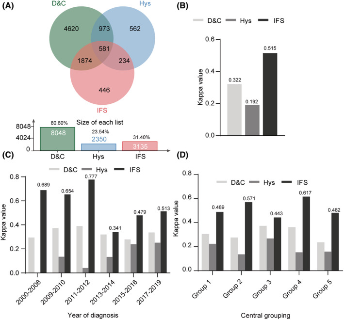
FIGURE 3.

Graphic representation of the utility differences in detecting endometroid adenocarcinoma with grade 3 between D&C, Hys, and IFS. (A) Wayne chart representation of different methods (D&C, Hys and IFS). (B) Histogram representation of the differences in diagnosis efficacy (Kappa values) between D&C, Hys, and IFS. (C) Stratified consistency analyses based on the diagnosis year. (D) Consistency analyses grouped by medical centers.
