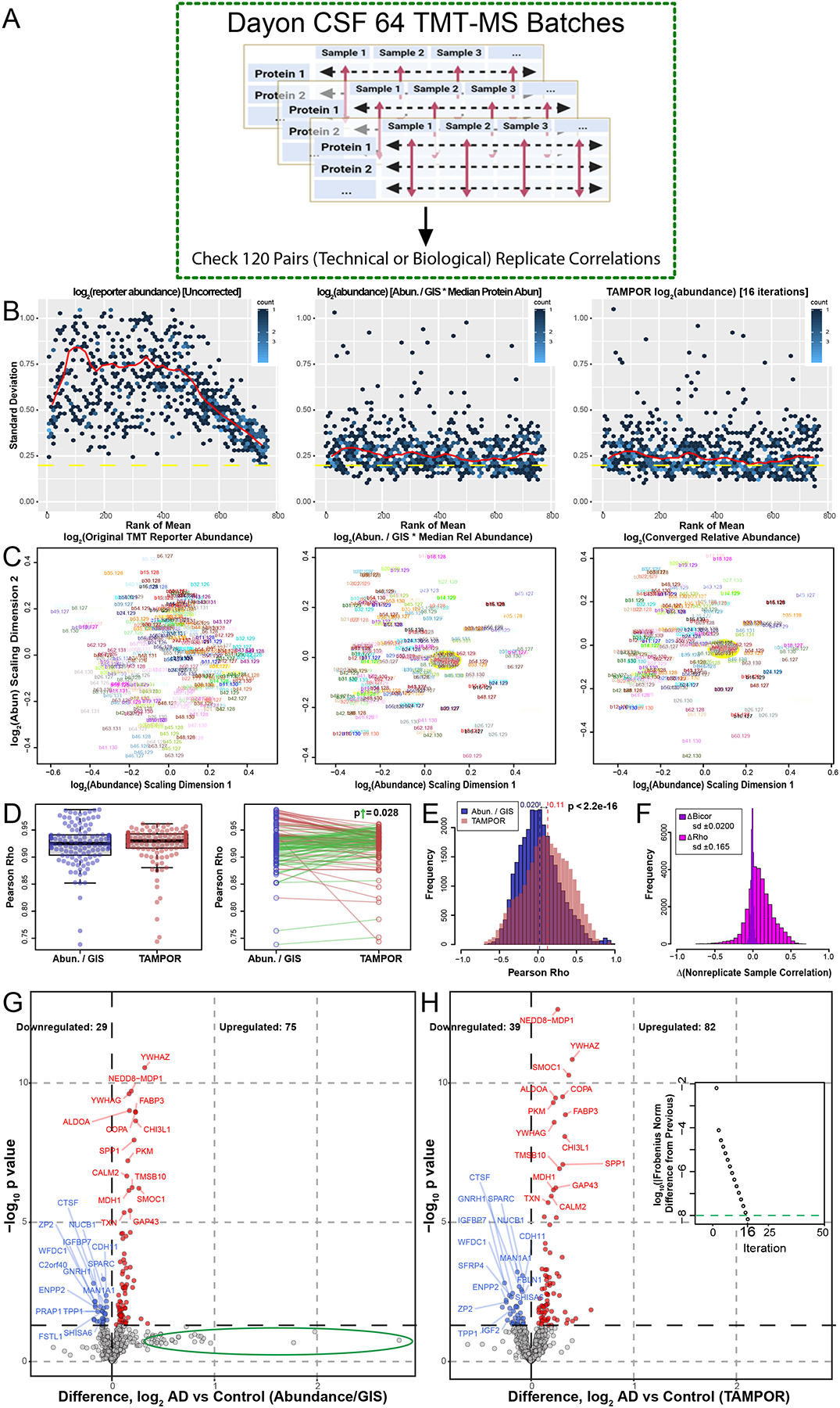
Figure 4. Use case 3: Comparison of TAMPOR versus naïve ratio of 64 batch TMT-MS CSF proteomics.

(A) One hundred and twenty case samples of CSF were analyzed by TMT-MS, each with a technical replicate in a different batch loaded equally by volume as published in (Dayon et al., 2018). We reanalyzed the publicly available raw data and performed a head-to-head comparison of naïve ratio of abundance/GISintrabatch to TAMPOR abundance, paying special attention to replicate and non-replicate correlations in the data. (B) Mean-SD plots show variance in log2 TMT abundance without ratio-based correction (left), with naïve ratio (center), and with TAMPOR (right). (C) MDS plots show changes in intersample variance from uncorrected TMT log2 abundance (left), to naïve ratio-corrected log2 abundance (center), to TAMPOR log2 abundance (right). Yellow ovals in the center and right panels indicate the location of GIS samples in the MDS plot near the plot origin or center. (D) The population median of Pearson correlation coefficients (rho) modestly increases in TAMPOR versus naïve ratio (left), and in comparisons of the same replicate pair’s correlation coefficients with naïve ratio-based correction (blue) and after TAMPOR (red), right. Sixty two green segments connect pairs increasing in correlation, and 58 red segments connect ones decreasing in correlation. The absolute magnitude of the increases in rho was significantly greater than that of the decreasing population determined by a one-tailed T test (p=0.028). (E) Histogram of the population of Pearson rho values for naïve ratio non-replicate pairs (n=28,560) among the 240 samples in the cohort for naïve ratio-corrected abundance (blue), and TAMPOR abundance (red, overlain transparent bars). Population means are shown above each dashed line at the mean Pearson rho for each population. The difference of means was significant (p<2.2×10⁻¹⁶). (F) Change in Pearson rho (magenta bars) or bicor (deepviolet narrower bars) for the same pairs were plotted as a population histogram. The distribution of Pearson rho value differences is skewed positive, whereas the narrow distribution of differences in bicor values has no skew and centers at a mean of 0. (G) Volcano plot of the 769 proteins in naïve ratio-corrected proteomes of the 120 averaged sample replicate data. The green ellipse indicates proteins which shift substantially away from a large but insignificant positive log2 fold change in the data after TAMPOR correction. (H) Following TAMPOR, the volcano plot captures 17 more significant differentially abundant proteins. Inset, TAMPOR convergence plot shows the convergence criterion (green dashed line) was reached after 16 iterations.
