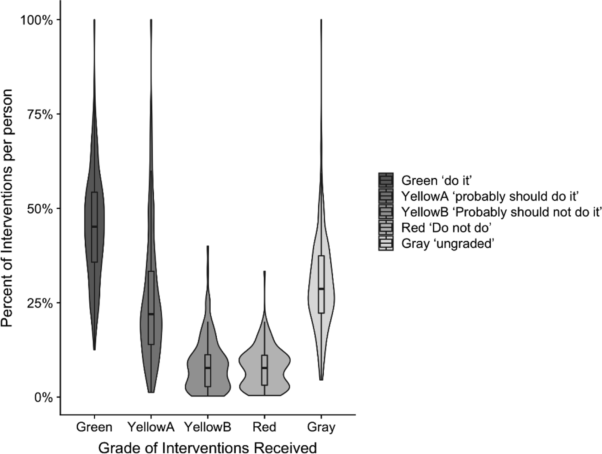
Figure 1.

Percent of interventions per individual for the evidence grades, green ‘do it’, yellow ‘probably should do it’, yellow ‘probably should not do it’, red ‘do not do it’ and ungraded.
Violin plots indicate the percent of interventions per individual for each category. The box and whisker plots indicate median score (middle line), bars show interquartile ranges, and violin width represents the density distribution of the data. Wider sections of the violin plot represent a higher probability that members of the population will take on the given value; the narrower sections represent a lower probability.
