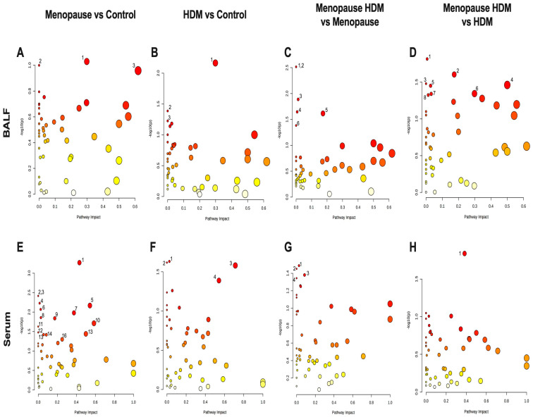
Figure 3.
Pathway analysis plots for group comparison in BALF (A–D) and serum (E,F). (A,E) Menopause vs. Control; (B,F) HDM vs. Control, (C,G) Menopause HDM vs. Menopause; (D,H) Menopause HDM vs. HDM. The log p-values of the significantly different metabolites are plotted within a given metabolic pathway by the impact score that those metabolites have on the pathway. The size of the circle correlates to the number of significantly different metabolites detected for that pathway. Numbers next to circles correspond to numbers next to pathways listed in Table 3 and Table 4.

