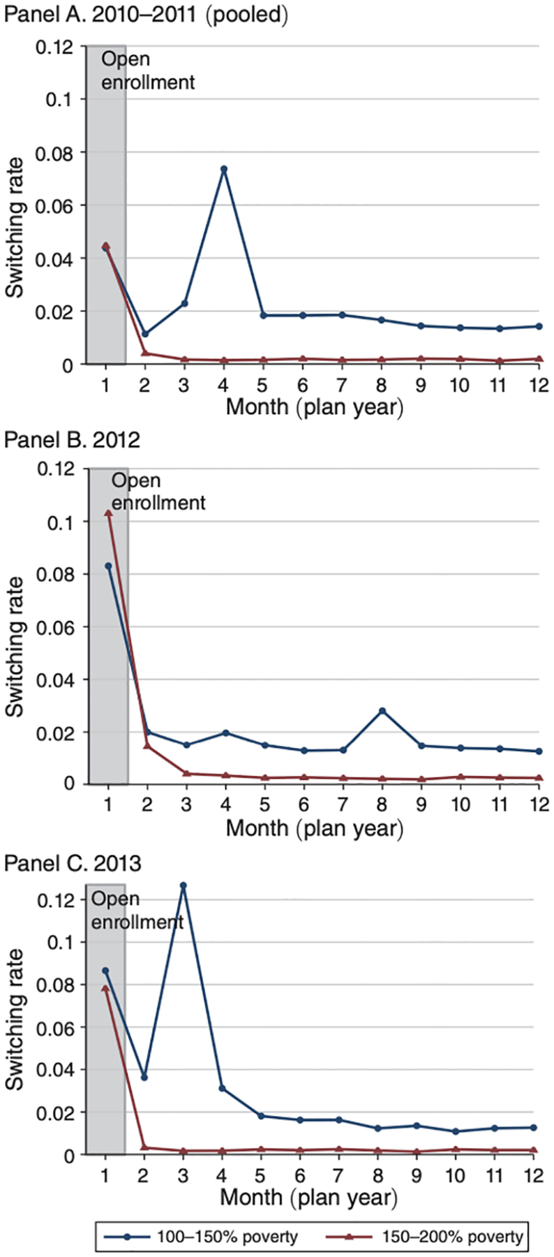
Figure 1.

Share of Enrollees Switching Plans, by Month
Notes: The figure shows the share of sample enrollees who switch plans by month of the year for the treatment group subject to auto-retention (100–150 percent of poverty, in blue) and control group not subject to the policy (150–200 percent of poverty, in red). Panel A shows 2010–2011 (pooled because of similar patterns); panel B shows 2012; panel C shows 2013. Open enrollment, when switching is typically allowed, is shaded in gray. Higher switching rates in all other (“mid-year”) months for the treatment group indicate the impact of the auto-retention policy.
