
Figure 2.
Plan Switching, by Origin Plan Free/Nonfree Status
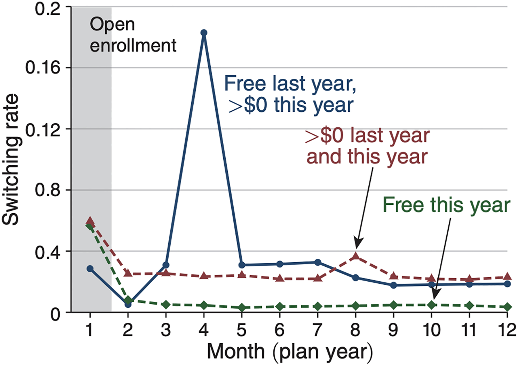
Notes: The figure breaks down switching rates for the treatment group (100–150 percent of poverty) by the free/nonfree status of the origin plan to understand the source of the large switching spike in Figure 1. It shows monthly switching rates out of three types of plans: (i) plans that were free last year but become nonfree this year (blue solid line), (ii) plans that were nonfree (>$0) both last year and this year (red dashed), and (iii) plans that are free this year, regardless of their premium last year. Statistics are pooled across 2010–2012 for simplicity, with 2013 omitted because of its different timing of the spike (month three rather than month four). Results are similar if broken down separately by year (see online Appendix Figure B.2). The figure indicates that all of the large switching spike comes from enrollees in plans that change from being free to nonfree at the start of the new year.