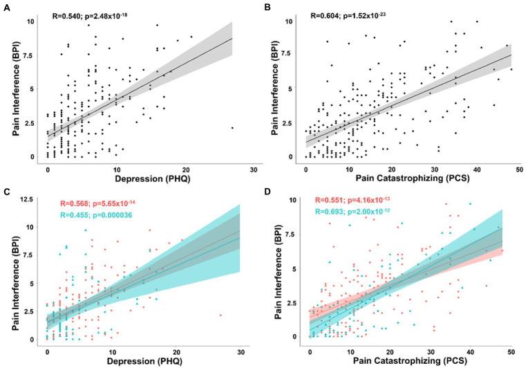
Figure 3.
(A) Scatterplot displaying the correlation between pain interference and depression as measured by the PHQ. (B) Scatterplot displaying the correlation between pain interference and pain catastrophizing as measured by the PCS. (C) Scatterplot displaying the correlation between pain interference and depression separated into female (coral/red) and male groups (arctic green/cyan). (D) Scatterplot displaying the correlation between pain interference and pain catastrophizing separated into female (coral/red) and male groups (arctic green/cyan). Gray, coral, and arctic green shaded areas correspond to 95% confidence curves.

