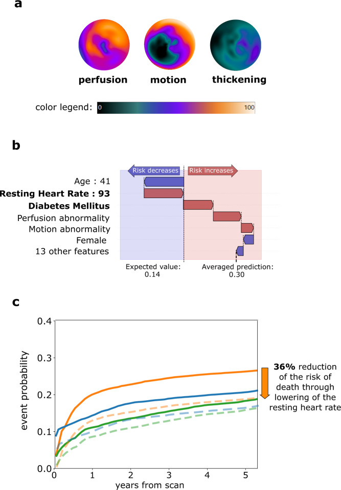
Fig. 5. Patient-level risk explanation with simulated modification of risk factors.
a Polar map visualization of perfusion, motion, and thickening of a 41-year-old female with no history of CAD, LVEF of 39%, and BMI of 31. Volume and degree of affected myocardium (0-100%) is visualized using color on the polar map, as shown on a color legend. b Waterfall plots present the influence of top features (including averaged contributions from polar maps) on prediction of average risk of death. The plot starts at the top at the mean population probability (expected value, dotted vertical line) and ends at the bottom with the final individual probability. Red arrows pointing to the right indicate that the feature increases the risk of death, while blue arrows pointing to the left indicate that the feature decreases the risk. Patient features that point to potential actionable interventions through medication or lifestyle modification are highlighted using bold font. c Simulated modification of risk factors through reduction of resting heart rate to 70/min reduces the average risk of death by 36%. The predicted probabilities of death, ACS and revascularization before the intervention is shown as orange, green and blue lines, respectively. The predicted probabilities of death, ACS and revascularization after heart rate reduction are shown as orange, green and blue dashed lines, respectively. ACS acute coronary syndrome, CAD coronary artery disease, LVEF left ventricular ejection fraction, BMI body mass index, PCI percutaneous coronary intervention, CABG coronary artery bypass grafting.

