Figure 6.
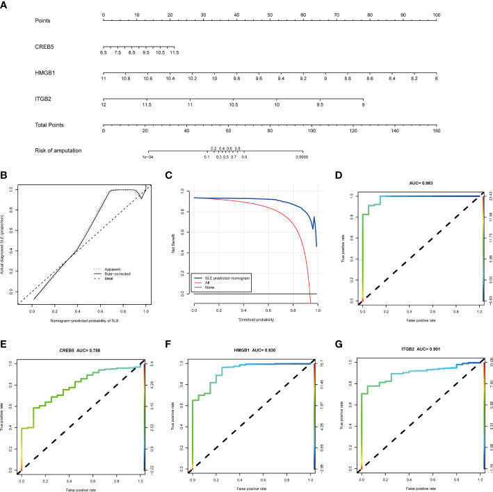
The performance of hub genes in the training set. (A) Construction of a nomogram for predicting the occurrence of SLE based on hub genes. (B) Calibration curve. The y-axis is the actual rate of SLE diagnosis and the x-axis is the predicted risk of SLE. The diagonal dotted line represents a perfect prediction by an ideal model. The solid line represents the bias−corrected performance of the nomogram, where a closer fit to the diagonal dotted line represents a better prediction. (C) Decision curve analysis. The blue represents the net benefit of the nomogram in the prediction of SLE occurrence. The red line represents the assumption that all people have SLE. The black line represents the assumption that all people do not have SLE. (D) ROC curve of the three hub genes combined diagnosis of SLE. (E) ROC curve of CREB5 gene diagnosis of SLE; (F) ROC curve of HMGB1 gene diagnosis of SLE; (G) ROC curve of ITGB2 gene diagnosis of SLE. SLE, systemic lupus erythematosus; ROC, receiver operating characteristic.

