
Figure 4. DCP1 protein accumulates at edges and then vertices during development.
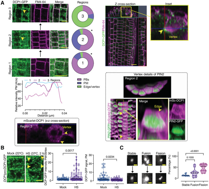
- Left: Gradual edge or vertex accumulation of DCP1‐GFP in three different root regions. DCP1 signal intensity among the three different regions, at the edge/vertex (epidermis). Right: z cross‐sectional images of DCP1‐GFP (green) in the whole root compared to FM4‐64 staining (magenta, staining membranes). The circular plots indicate the average DCP1 localization (regions 1–3; N, biological replicates = 3, n = 10 cells; comparing regions 1–2 and 2–3). The 3D‐rendered images (PIN2‐GFP vs. mSCarlet‐DCP1) show the localization of mScarlet‐DCP1 at edges/vertices in two different regions (in comparison to PIN2‐GFP signal which decorated almost evenly the PM). Scale bars: 20 μm. Arrowhead denotes the edge (region 2) and the vertex (region 3) decorated by mScarlet‐DCP1 (also in the z cross‐sectional image). Note in a single cell file, how the localization from the PM changes to the edge, as indicated, along the proximodistal axis.
- Representative confocal micrograph of DCP1‐GFP (DCP1pro:DCP1‐GFP, transgene) in root meristematic cells under NS/HS conditions (region 2). Scale bars, 5 μm. Note the depletion of DCP1 from the PM upon HS, but the increased edge/vertex signal (yellow arrowheads denote the vertex signal). Right: DCP1 signal intensity at the PM or edge/vertex (N, biological replicates = 3, n (pooled data of 3 biological replicates) = 18–23 PMs or edges/vertices).
- Representative confocal images showing fusion (coarsening), fission, and growth of PBs (DCP1‐positive) at the PM (region 3). Right: states of PBs (dynamic: fusion and fission and non‐dynamic: stable; N, biological replicates = 2, n (pooled data of 3 biological replicates) = 6–8 PBs). As a cautionary note, the “stable” PBs may not show dynamicity in the imaging time used (~ 3–5 min) but later, may do.
Data information: In (A), *P < 0.05 was determined by a nested t‐test. In (B), P values were determined by the Kolmogorov–Smirnoff, while in (C) by one‐way ANOVA. Upper and lower lines in the violin plots when visible, represent the first and third quantiles, respectively, horizontal lines mark the median and whiskers mark the highest and lowest values.
Source data are available online for this figure.