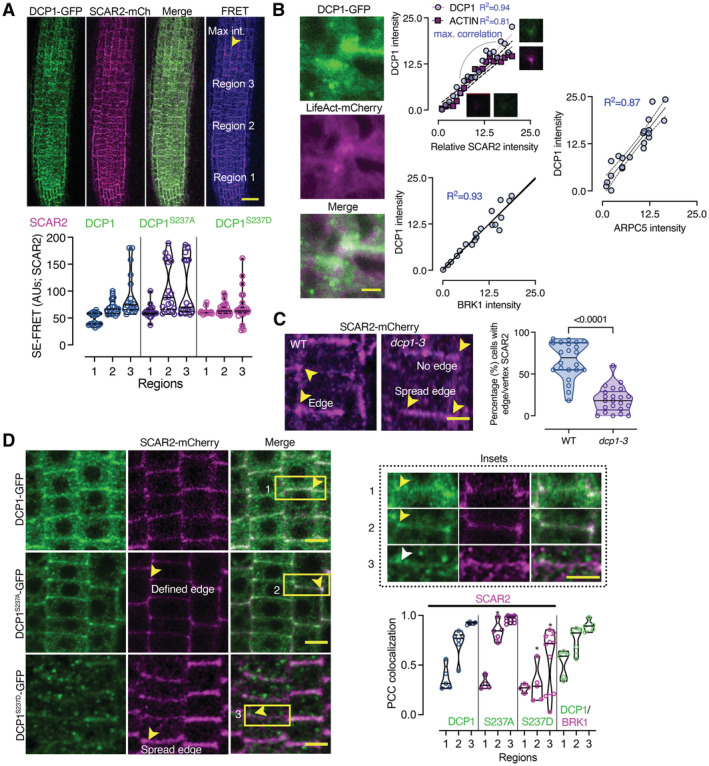
Figure 9. Mutual potentiation of DCP1 and SCAR‐WAVE localization at the edge/vertex.

- SE‐FRET efficiency between DCP1‐GFP or its phosphovariants with SCAR2‐mCherry (among the three different root regions; mainly epidermal cells). Scale bar: 50 μm. The arrowhead denotes high FRET efficiency at edges/vertices of region 3. Right: signal quantification of SE‐FRET efficiency between the indicated combinations at the epidermis of 3 regions (N, biological replicates = 6, n (pooled data of 3 biological replicates) = 10).
- Actin nucleation site at an edge/vertex, as indicated by DCP1‐GFP and LifeAct‐mCherry localization. Right: correlation between DCP1 intensity, ACTIN, SCAR2, BRK1 and ARPC5 intensities (simple regression model). The R 2 values are shown, along with representative micrographs for DCP1/SCAR2 (N, biological replicates = 3, n = 6 for each point).
- Representative confocal micrographs showing SCAR2‐mCherry localization in WT and dcp1‐3 mutant, respectively (root region 2, epidermal cells) and quantification of edge/vertex with SCAR2 a confined signal (N, biological replicates = 3, n = 5–8 cells).
- Representative confocal micrographs showing the colocalization between DCP1‐GFP or phosphovariants and SCAR2‐mCherry in root meristematic cells (root region 2, epidermal cells). Scale bars: 10 μm. The insets show details of colocalization; the white arrowhead denotes the expansion of the SCAR2/DCP1 domain, while the yellow arrowheads the restricted edge/vertex SCAR2/DCP1 domains. Scale bars: 3 μm. The graph indicates the relative signal intensity for the indicated combinations (as Pearson's correlation coefficient; N, biological replicates = 3, n = 5 at edges/vertices: spread edges were not considered in calculations).
Data information: In (A and B), *P < 0.005 were determined by nested one‐way ANOVA relative to the WT in the respective region. In (B), a simple linear regression (best‐fitted model) with a 95% confidence interval is shown with dashed lines. In (C and D), P values were determined by an unpaired t‐test. Upper and lower lines in the violin plots when visible, represent the first and third quantiles, respectively, horizontal lines mark the median and whiskers mark the highest and lowest values.
Source data are available online for this figure.
