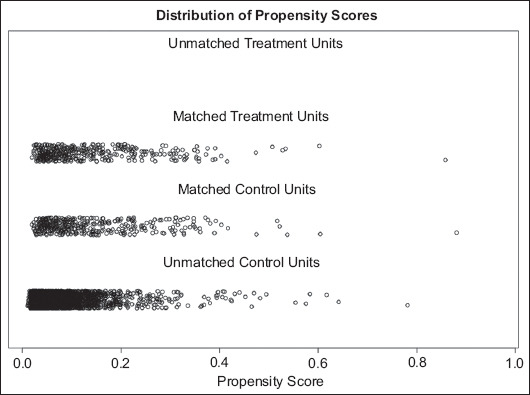
Figure 1.

Distribution of propensity scores following matching. Frail patients are shown as Matched Treatment Units and propensity matched non-frail patients are shown as the Matched Control Units. The Unmatched Control Units represent non-frail patients who were not chosen by the propensity matching algorithm. The comparable distribution of patients in both matched treatment and control units implies achievement of excellent propensity score matching
