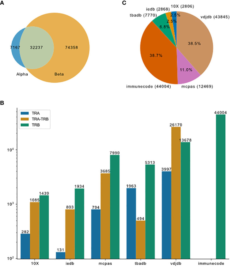
Figure 2.

Overview of TCR-pMHC binding data merged from different resources. (A) Venn plot shows the overlap of entries that contain only TRA, paired chains or only TRB. The size of the ellipses correlate to the number of entries for each category. (B) Pieplot shows the composition of the merged database. Number of entries in each resource indicated in the parentheses. (C) TRA and TRB availability for the six major resources.
