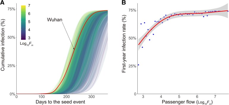
Fig. 2.
A) The curves of pandemics randomly seeded in 300 cities across the world. Colors indicate the relative size of the seed city's total passenger flow (Log10Fm). B) The relationship between first-year infection rates and the passenger flow of the seed cities (Log10Fm). Line denotes the best estimate using GAMs. The gray area denotes the 95% CIs.

