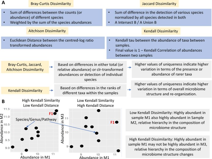
Extended Data Fig. 1. Different uniqueness measures and their implications.
A. Summary description of the inter-microbiome distance calculation using the four different distance metrics and the aspects of gut microbiome variation captured by the different distance matrices. B. Pictorial illustration of the meaning of high or low Kendall similarity measures using three different hypothetical microbiomes (M1, M2 and M3). While Microbiomes M1 and M2 have a high Kendall Similarity, M1 and M3 do not. The two sub-plots pictorially elaborate this. Each point in the two sub-plots represents a feature which may be either the abundance of a species or genus or pathway. In the left sub-plot, the y-value of each represents the abundance of the corresponding features in M2 and the x-value represents the abundance of the same feature in M1. In the right sub-plot, the y-value of each point represents the abundance of the corresponding features in M3 and the x-value represents the abundance of the same feature in M1. As observed, in the left sub-plot of higher Kendall similarity (and low Kendall distance), highly abundant features in M1 (for example the feature F1 highlighted in red) are also highly abundant in M2. Thus, the ranking of the features in terms of their abundance in M1 and M2 are similar. This is not observed between M1 and M3 which have lower Kendall similarity and higher Kendall distance.

