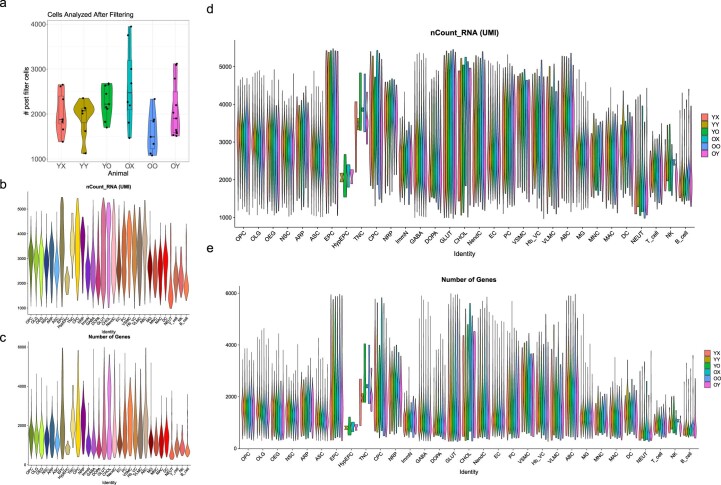
Extended Data Fig. 5. Primary data analysis.
a. Violin plot and boxplot showing the number of cells analyzed by animal after cell filtering, in which all cells were successfully assigned to a specific cell type. Each dot represents one animal. Boxplot minimum is the smallest value within 1.5 times the interquartile range below the 25th percentile, maximum is the largest value within 1.5 times the interquartile range above the 75th percentile. Boxplot center is the 50th percentile (median), box bounds are the 25th and 75th percentile. b-e. Violin plots showing QC metrics, plots in (b, c) showing aggregated data of cells of all brain types, while plots in (d, e) showing individual cell data separated by animal type: (b, d) showing nCount RNA (UMI) per cell type. (c, e) showing nFeature RNA (number of unique genes) detected per cell.

