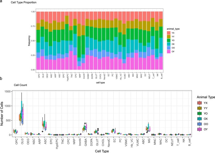
Extended Data Fig. 7. Cell type composition and cell count from each animal type.
a. Frequency bar plot demonstrating composition of each cell type with respect to animal type. b. Boxplot of raw cell counts with respect to each animal. All animals contribute to all cell types. ANOVA p-values (one-tailed) for pairwise iterations can be found in Supplementary Table 2. The only comparisons with unadjusted p-values < 0.05 are: OOvOX: DC (p = 0.041), YOvYX DOPA (p = 0.022), YYvYX OEG (p = 0.046), ImmN (p = 0.045), and PC (p = 0.016), Boxplot minimum is the smallest value within 1.5 times the interquartile range below the 25th percentile, maximum is the largest value within 1.5 times the interquartile range above the 75th percentile. Boxplot center is the 50th percentile (median), box bounds are the 25th and 75th percentile. Outliers are >1.5 times and < 3 times the interquartile range.

