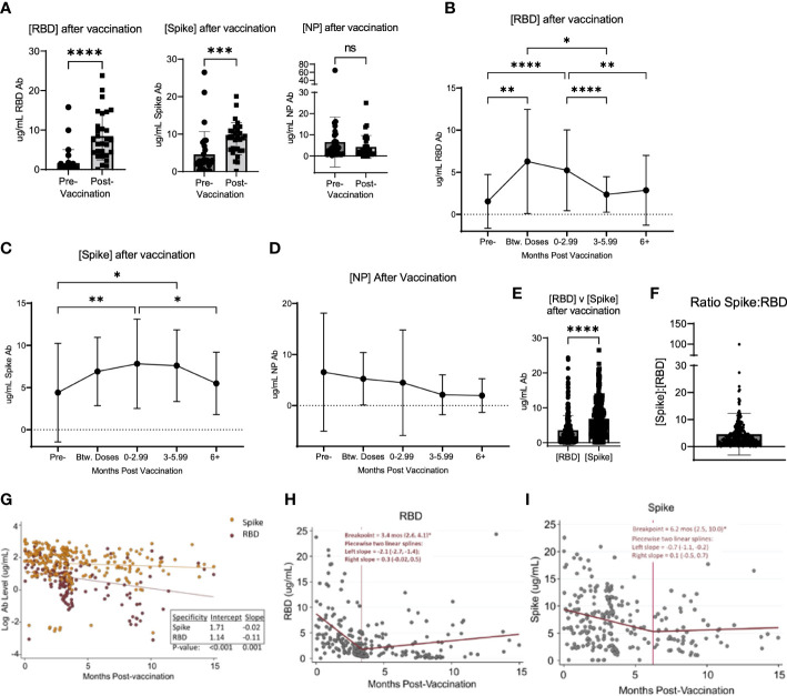
Figure 2.
Vaccination induced changed in serological response to SARS-CoV-2. (A) shows the change in the concentration of RBD, Spike, and NP in participants who were vaccinated over the course of the study. (B) shows the change in RBD, Spike (C), and NP (D) concentration after vaccination in all participants, regardless of when participants were vaccinated and when their blood was collected after vaccination. (E) shows the value of [RBD] and [Spike] in all participants after vaccination. (F) shows the ratio of the concentration of RBD to Spike for all participants after vaccination. (G) shows the log-transformed RBD (red data points) and Spike (orange data points) concentrations (i.e., to be consistent with exponential decay) over time using a GLS regression model (H) The lines represent the decay lines. Panel (H) shows the plot generated from piecewise linear regression models for the RBD protein or Spike protein (I). The vertical line represents the “breakpoint”, which is the estimate of when the two linear phases of raw decay change. The two decay phases are shown before and after each breakpoint. The breakpoint and decay slopes for the left and right portion are noted in the graphs. * designates P >0.05, ** designates P >0.01, *** designates P >0.001, and **** designates P >0.0001. ns, not significant.

