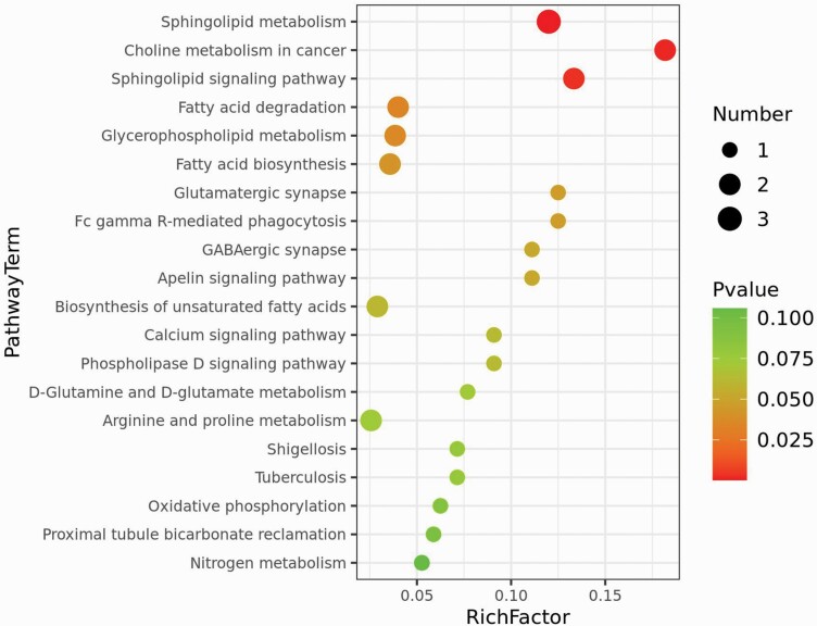
Fig. 3.
Bubble map of metabolic enrichment pathways. The y-axis depicts the metabolic pathways and the x-axis shows the rich factor. Rich factors are presented as enrichment degrees. The larger the rich factor, the greater the enrichment degree. The color scale ranges from green to red and represents a higher significance to a lower significance, respectively. The area of each node denotes the number of enriched metabolites. The larger the node, the greater the number of metabolites is enriched in the pathway.

