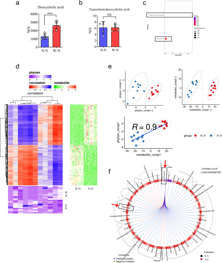
Fig. 4.
Elevated fecal DCAs are linked to an increased amount of Bacteroidetes. a, b Feces from mice in W-N and N-N groups were collected for bile acids detection through LC-MS/MS. The concentration of DCA and TCDCA in W-N and N-N groups were measured. c KEGG pathway enrichment analyses of the upregulated bile acids in the W-N group. The dot size represents the number of differential bile acids, and the dot color represents the corresponding p value. d (Upper left heatmap): Correlation cluster heat map of differential metabolites and microbial groups, the abscissa is microbial groups, the ordinate is differential metabolites, *P < 0.05, **P < 0.01, red means negative correlation, and blue means positive correlation. The deeper the color is, the stronger the correlation is. (Lower left heatmap): Heatmap of relative abundance of microbial groups at the phylum level. Rows represent samples, row names represent group names, and columns represent microbial groups. From purple to blue, relative abundance changes from low to high. (Upper right heatmap): Heatmap of the abundance of differential metabolites. Rows represent differential metabolites, columns represent samples, and column names represent group names. From green to red, relative abundance changes from low to high. e (Upper left heatmap): In the component scatter plot of the microbial group, the abscissa is the first component value, and the ordinate is the second component value; (Upper right heatmap): the component scatter diagram of differential metabolite, the abscissa is the first component value, and the ordinate is the second component value. (Lower left heatmap): Pearson correlation scatter plot of the differential metabolites and the first component of the microbiome. The vertical axis is the value of the first component of the metabolic pathway, and the horizontal axis is the value of the first component of the microbiome. A larger R indicates a higher correlation between the microbiome and the first component of the metabolic pathway. Each point in the panel represents a sample, and the colors and ellipses represent sample groups. The greater the dispersion of samples in different groups, the better the classification of that component. f Ring diagram of a correlation between different metabolites and microorganisms. The broken line around the ring represents the abundance of different metabolites and microbial groups in each group. The distance between the broken lines represents the difference between groups. The threshold value of the correlation coefficient is shown in the upper right corner. Only the different metabolites and microbial groups with the absolute value of correlation coefficients greater than the threshold have a line. The blue line represents positive correlations, and the red line represents negative correlations. a, b Data represent means ± SEM; NS, not significant; ***P < 0.001; by unpaired Student’s t test

